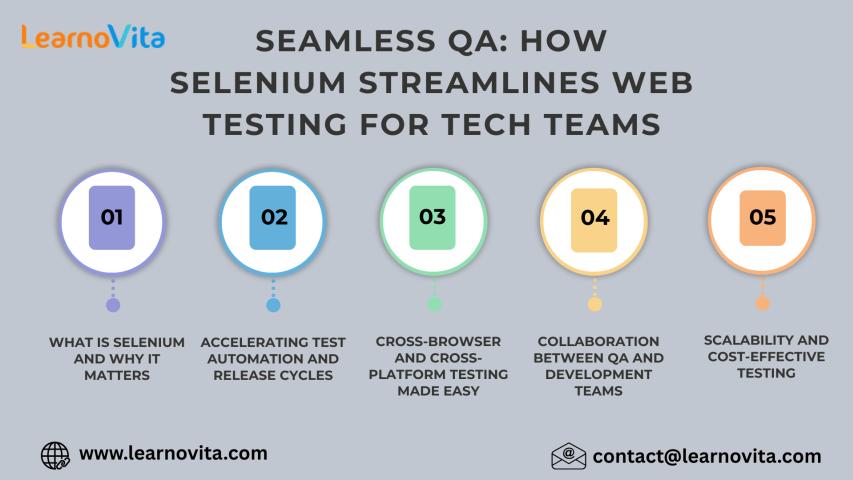

Introduction
Today’s users browse websites on a wide range of devices: laptops, tablets, smartphones, smart TVs, and more. Each device comes with its unique screen resolution and browser dimensions. That's why responsive design is no longer optional; it's a must-have.
But here's the real challenge: How do you test a responsive web application efficiently and accurately across all these variations?
Manual testing is time-consuming, error-prone, and simply not scalable. That’s where Selenium automation testing steps in. With Selenium, you can simulate multiple screen sizes, run automated tests across devices, and verify that your UI behaves consistently.
Whether you're a beginner or a seasoned tester, this blog ideal for those enrolled in a Selenium certification course or exploring an online Selenium course will walk you through step-by-step strategies to test responsive web apps with Selenium.
1. What Is Responsive Web Design?
Responsive web design (RWD) is a development approach where a website's layout adapts to different screen sizes and devices. Instead of creating multiple versions of the same site, developers use CSS media queries, flexible grids, and images to ensure a seamless user experience.
Key Aspects of Responsive Design:
Fluid grids and layouts
Scalable images
Media queries in CSS
Dynamic content rendering
2. Why Testing Responsiveness Matters
Studies show that mobile users account for over 58% of global website traffic. If your site doesn’t display well on mobile, you risk losing a significant chunk of your audience.
Why testing matters:
Boosts user experience on all devices
Ensures cross-browser compatibility
Prevents layout breakages
Increases conversion rates
If you're pursuing a Selenium certification or completing an online selenium course, mastering responsive testing is a must-have skill.
3. Can Selenium Test Responsive Web Applications?
Yes! Selenium WebDriver allows you to:
Resize browser windows to test different screen dimensions
Automate test cases across multiple viewports
Capture screenshots at various resolutions
Integrate with tools like BrowserStack, LambdaTest, or Dockerized Selenium Grid
Selenium’s cross-browser, multi-device support is why it's the core focus of any well-structured selenium course.
4. Setup: Tools and Technologies Required
Before diving into testing, ensure you have the following:
Prerequisites:
Installed Selenium WebDriver
Java/Python/C# for scripting
ChromeDriver or GeckoDriver
Optional: BrowserStack or Selenium Grid
If you're enrolled in a Selenium certification course, your instructor will likely guide you through these installations.
5. Strategies to Test Responsiveness with Selenium
Let’s break down a few actionable strategies.
5.1 Resize the Browser Window
You can simulate different screen sizes by manually resizing the browser using driver.manage().window().setSize().
Code Snippet in Java:
java
Dimension mobileSize = new Dimension(375, 667); // iPhone 6/7/8
driver.manage().window().setSize(mobileSize);
Python Equivalent:
python
driver.set_window_size(375, 667)
5.2 Use Chrome DevTools Mobile Emulation
Chrome’s mobile emulation feature can be triggered through ChromeOptions in Selenium.
Python Example:
python
from selenium import webdriver
mobile_emulation = { "deviceName": "Nexus 5" }
options = webdriver.ChromeOptions()
options.add_experimental_option("mobileEmulation", mobile_emulation)
driver = webdriver.Chrome(options=options)
5.3 Run Tests Across Multiple Resolutions
Build a test loop that iterates over common resolutions:
python
resolutions = [(1920, 1080), (1366, 768), (768, 1024), (375, 667)]
for width, height in resolutions:
driver.set_window_size(width, height)
driver.get("https://yourwebsite.com")
# Run assertions
This method is especially helpful for testers pursuing a selenium certification course where cross-device automation is a key learning outcome.
6. Step-by-Step Example Using Selenium and Chrome DevTools
Let’s walk through a mini project.
Objective:
Test a shopping cart UI on mobile and tablet views.
Tech Stack:
Python
Selenium WebDriver
Chrome mobile emulation
Steps:
Set Up WebDriver with Emulation
Load the Shopping Cart Page
Assert Element Visibility and Layout
Capture Screenshot for Validation
Full Code:
python
from selenium import webdriver
devices = ["iPhone X", "iPad", "Pixel 2"]
for device in devices:
mobile_emulation = { "deviceName": device }
options = webdriver.ChromeOptions()
options.add_experimental_option("mobileEmulation", mobile_emulation)
driver = webdriver.Chrome(options=options)
driver.get("https://example.com/shopping-cart")
assert "Cart" in driver.title
driver.save_screenshot(f"{device}_screenshot.png")
driver.quit()
This hands-on experience is often included in a good online selenium course with real-world projects.
7. Advanced Techniques for Responsive Testing
7.1 Integrate with BrowserStack or LambdaTest
These platforms allow you to run tests on actual devices:
python
desired_caps = {
'browserName': 'Chrome',
'device': 'Samsung Galaxy S21',
'realMobile': 'true',
'os_version': '11.0'
}
driver = webdriver.Remote(
command_executor='https://hub-cloud.browserstack.com/wd/hub',
desired_capabilities=desired_caps
)
7.2 Visual Regression Testing
Use tools like Applitools or Percy to detect layout shifts.
7.3 Responsive Grid Frameworks
Test responsive behavior with Selenium using Bootstrap or Material UI grid classes for layout validation.
8. Common Challenges and Solutions
Challenge | Solution |
Inconsistent rendering across devices | Use cloud-based testing tools |
Dynamic content loading | Use explicit waits |
Locating elements in different layouts | Use dynamic XPath or CSS selectors |
Test script maintenance | Use Page Object Model (POM) |
These strategies are often covered extensively in a high-quality selenium course.
9. Real-World Case Studies
Case Study 1: E-Commerce Platform
A leading online retailer automated their mobile UI testing using Selenium and BrowserStack. Result: 30% reduction in manual testing time.
Case Study 2: Government Portal
A state-run portal ensured accessibility across devices by integrating Selenium with Applitools. Result: 40% improvement in responsive bug detection.
These results show the practical impact of skills taught in any selenium certification course.
Key Takeaways
Selenium supports robust responsive web testing
You can resize browser windows or emulate devices using ChromeOptions
Advanced tools like BrowserStack and Applitools enhance test reliability
Real-world applications of these skills are career-boosting
Mastering these techniques is crucial for anyone pursuing a selenium certification or learning from an online selenium course
Conclusion
Responsive testing is no longer optional; it's essential. Selenium provides powerful features to automate this process, making your applications user-friendly across all devices.
Ready to become a Selenium expert?
Join our Selenium certification course or start with our online selenium course today and future-proof your automation skills!