
I spent three months staring at paint swatches last year. Three months. My partner thought I'd lost it. "It's just beige," he'd say, holding up two samples that looked identical to him but were worlds apart to me.
But here's the thing I learned after painting nearly every room in our Corpus Christi home: location matters more than house paint colors. You can pick the perfect shade of blue, but if you put it in the wrong room, it's still going to feel off.
So let me save you some of those three months. Here's where interior painting actually makes a difference, and where you're probably overthinking it.
Spots In Your Home You Should Definitely Paint
The Front Door (Yes, Really)
I painted our front door on a whim one Saturday. We'd been talking about it for months, but I finally just grabbed a can of deep teal and went for it.
The next day, our neighbor knocked and asked if we'd done other work to the house. She couldn't put her finger on it, but something looked "refreshed." That's when I realized: people notice the door first, even if they don't consciously register it.
A bold door color does something magical. It signals personality without requiring commitment to that color anywhere else. I've seen soft coral doors on gray houses, forest green on brick, even a burnt orange that somehow worked on a cream exterior.
The trick is picking something that feels like you, not like a trend. And if you live somewhere humid, spend the extra money on exterior-grade paint. I learned this the hard way when my first attempt started peeling after one summer.
Living Rooms
This was my biggest mistake initially. I painted our living room a trendy dark gray because I'd seen it in a magazine. It looked incredible in the photo.
In our actual house? It made the room feel like a cave. We don't have huge windows, and that dark color swallowed every bit of light we did have.
Hired interior painters six weeks later, and they suggested a warm white with just a hint of beige. Suddenly, the room felt twice as large. Our furniture looked better. Even our mood improved when we sat in there.
Neutrals get a bad reputation for being boring, but they're neutral for a reason. They let your life fill the space instead of fighting with it. That said, I did eventually add one accent wall in a muted sage green. It gave the room character without overwhelming it.
Test your color at different times of day. That gorgeous gray at noon might look completely different under lamplight at 7 PM.
Hallways and Stairs
Nobody dreams about painting their hallway. But you walk through it a dozen times a day, brush against the walls, scuff it with bags and shoes.
I initially skipped our hallway when painting, thinking I'd get to it later. Four months in, it was the only dingy space left, and it made the whole house feel half-finished.
When I finally painted it, I went with a durable satin finish instead of flat paint. It's held up remarkably well, and I can actually wipe off marks without removing the paint underneath.
Light colors work best here because hallways rarely have windows. I chose a soft greige that tied together the rooms on either end. It's not exciting, but that's kind of the point. Hallways should connect spaces, not compete with them.
Kitchen
I almost painted our kitchen a sunny yellow. I'd convinced myself it would feel cheerful and bright.
Thank goodness I tested it first. That yellow looked radioactive in the morning light.
Kitchens already have so much going on: cabinets, countertops, appliances, the stuff that inevitably lives on your counters, no matter how much you try to declutter. Adding a loud wall color just creates visual chaos.
I settled on a very pale gray with slight blue undertones. It feels clean and fresh, reflects the light beautifully, and doesn't compete with anything else in the space.
The dining area got slightly warmer treatment, a soft, earthy taupe that makes the space feel cozy for meals without being too heavy.
Bedrooms
This is where I finally got to have some fun.
Our bedroom is painted a color that can be called "misty blue" but really just looks like a very pale, slightly grayish blue. It's the most calming room in our house. I swear we sleep better since repainting it.
My office, on the other hand, is a deeper sage green. It helps me focus somehow, makes the space feel separate from the rest of the house.
The guest room stayed white. Boring? Maybe. But it's also the room we painted once and never thought about again, which feels like a win.
I learned that bedrooms can handle more personality than public spaces because you're the one who has to live with it. If a color makes you happy when you wake up, that's all that matters.
Bathrooms
Our main bathroom is tiny. Like, hilariously small. The first color I chose, a medium blue, made it feel even smaller.
I repainted it in an off-white with the slightest warm tint, and suddenly it felt bigger and cleaner. Light colors really do make a difference in compact spaces.
I also learned to use semi-gloss paint in bathrooms. The moisture resistance is real, and it's so much easier to clean. Our previous flat paint would show water spots and never quite wipe clean.
The Details Nobody Talks About
After the house painting was finished, I noticed the trim looked yellowed and sad. So I repainted all of it in crisp white.
That might have made a bigger difference than any wall color. Fresh trim makes everything look polished and intentional. It frames the walls like a mat frames art.
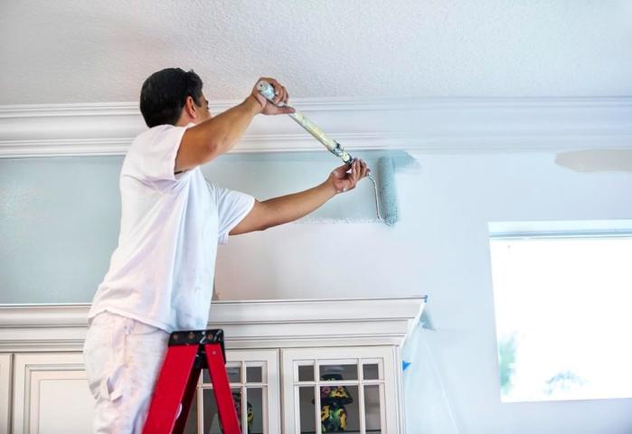
I also painted our ceilings. Not in anything dramatic, just a white that's one shade lighter than the walls. It's a subtle trick that makes rooms feel taller.
These details take time, but they're what set a room that looks "painted" apart from one that looks professionally done.
What Actually Matters When It Comes To House Painting
After all this painting, here's what I've figured out: color matters less than light, purpose, and finish.
Choose colors based on how much natural light a room gets. Dark colors in dark rooms make them darker. Light colors in bright rooms make them brighter. It's not complicated, but it's easy to forget when you're staring at pretty paint chips.
Think about what happens in each room. High-traffic areas need durable finishes. Bedrooms can be more adventurous because you control the lighting and mood.
And please, test your colors. Buy sample pots. Paint swatches on the wall. Live with them for a few days. I cannot stress this enough. That perfect color in the store might look completely wrong in your actual space.
Hiring Professionals Will Save You A Lot Of Backache And Headache
Home improvement shows make it look easy. Slap on some paint, maybe add an accent wall, and boom, transformed space.
The reality is messier. There's taping. There's primer. There's painting yourself into corners and getting it on surfaces you swore you'd protected. There's repainting when the first attempt doesn't work.
But here's something else I learned: sometimes the DIY route isn't worth it.
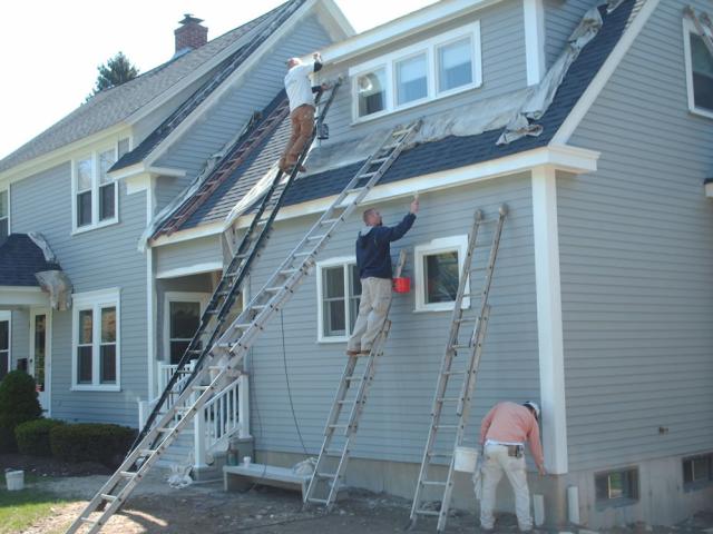
After doing most of the work on our house myself, I finally hired a professional painting service for the exterior. The difference was night and day. They knew which primers work best in coastal humidity and how to prep surfaces properly, and they finished in two days what would've taken me two weeks of weekends.
If you're in Corpus Christi or anywhere along the Gulf Coast, the climate adds another layer of complexity. Salt air, humidity, and intense sun all affect how paint holds up. A contractor who understands local conditions can save you from having to redo work in a year.
If you're considering a painting project, think about which battles are worth fighting. Interior accent walls? Go for it. Entire exteriors in humid climates? Maybe get a few quotes first.
Sometimes the most powerful change doesn't require knocking down walls or buying new furniture. Sometimes it just requires the right color in the right place, the patience to figure out which is which, and the wisdom to know when to call in someone who does this for a living.