A recruiter opens your profile, glances at the headline, and scrolls. The next thing that loads is your About section. In most profiles that section is one or two dense paragraphs, no line breaks, written the way people write a cover letter. On a laptop it reads fine. On a phone, where a lot of sourcing actually happens, it lands as a gray slab, and the reader has a few seconds to decide whether to keep going or move to the next tab.
LinkedIn gives you 220 characters for the headline and 2,600 for About. Most job seekers fill the About box once, usually during a job change, and never look at it again. The résumé is the document you agonize over. The profile is the thing you set up a few years ago and quietly forgot. That gap is worth closing, because the profile is often the first full read a recruiter gives you, and it is the one you can fix in about ten minutes without asking anyone's permission.
Why the About section gets skimmed
People underestimate how their profile is read. It is rarely read start to finish. It is scanned, on a small screen, by someone who has forty other tabs open and a role to fill. A block of text with no visual entry points gives that person nothing to grab. They are not judging your prose. They are looking for a fast answer to one question: is this the kind of person I need, and can I tell within a few lines?
Formatting helps only because it answers that question faster. It does not make you a stronger candidate. A well-spaced About section will not turn a mismatched background into an interview, and no amount of bold text changes what you have done. What it does is lower the effort of reading, so the recruiter reaches the part that matters before they give up.
A small before-and-after
Take a fairly typical opening line from a project manager's profile:
Experienced project manager with 9 years across fintech and logistics, skilled in stakeholder management, budgeting, and cross-functional delivery, passionate about building teams that ship on time and on budget.
Everything true is in there. The problem is that it arrives as one breath. Nobody scanning on a phone reads to the end of it. The same information, broken up, gives the reader somewhere to land:
Project manager, 9 years in fintech and logistics.
I run cross-functional delivery: scope, budget, and the schedule that keeps them honest.
Recent: led a payments migration that moved 40,000 daily transactions with no customer-facing downtime.
The second version is not fancier. It is easier to enter. LinkedIn's About editor has no real formatting controls, so the only tools you have there are line breaks and short paragraphs, and honestly those do most of the work.
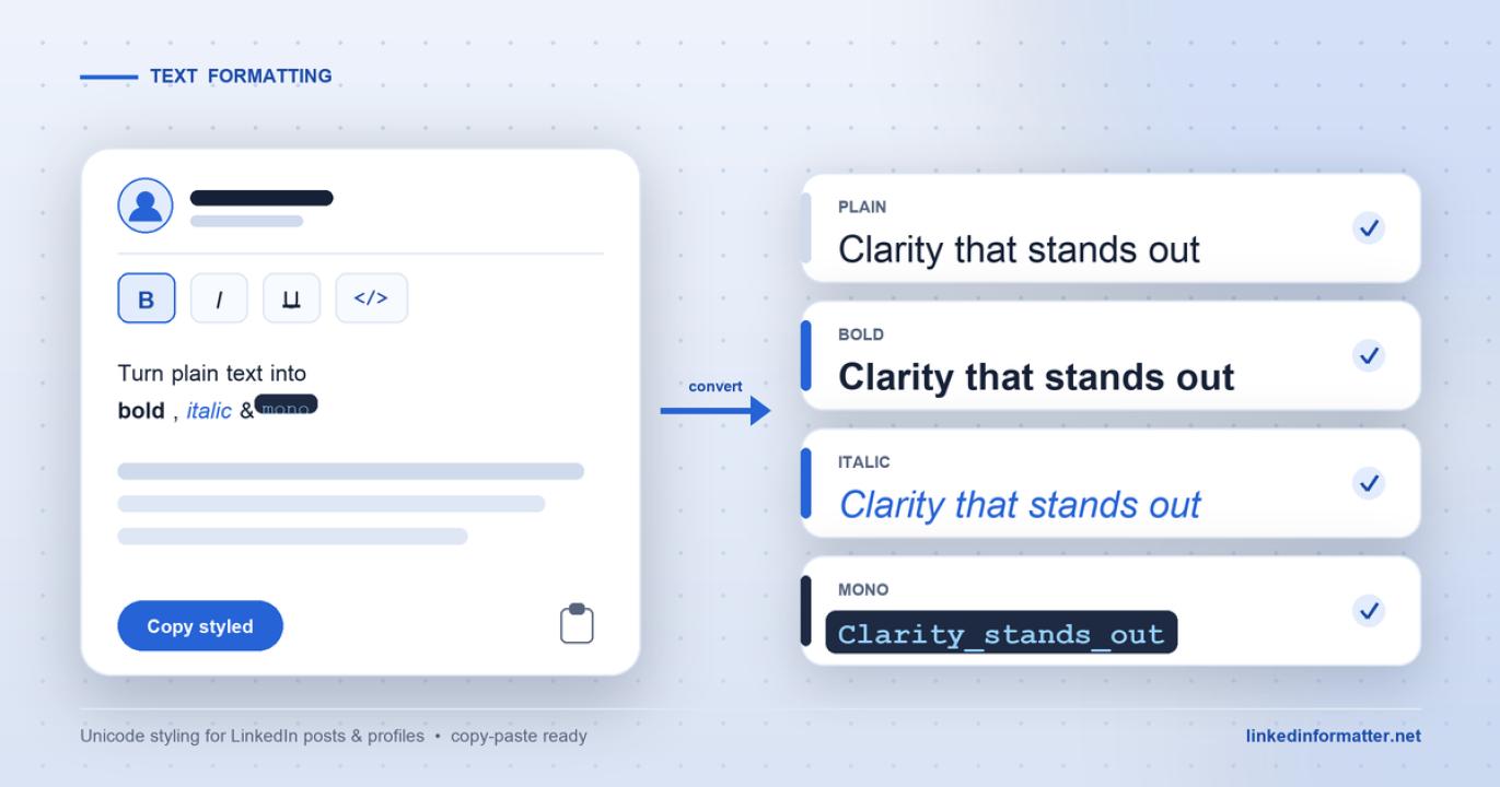
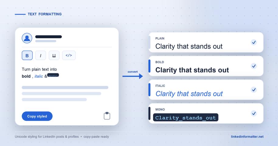
Where bold text comes in, and where it goes wrong
Sometimes you want one line to carry a little more weight. A single bold label at the top of a section, or one >
This is where profiles go off the rails. Used once, a bold line reads as intentional. Used on every heading and half the sentences, the profile starts to look like a printed flyer, and it quietly signals that you are trying hard to be noticed rather than trying to be clear. Restraint is the whole skill. One or two >
The practical trouble is that you cannot easily tell how a >free browser tool that previews the >, so you catch the overdone version before a recruiter does. The preview is the useful part. Seeing the >
The caveats that matter for a job search
There is a real cost to those Unicode characters, and for job seekers it is worth spelling out.
- Screen readers struggle with it. Styled Unicode is not the same letter with a bold >
- Search can miss it. When your text is built from look-alike characters, keyword matching does not always treat it as the plain word. Putting your actual job title in >
- Keep it out of your résumé. This matters most. Applicant tracking systems parse plain text, and Unicode styling can come through as garbled characters or get dropped entirely. Style is a LinkedIn-profile convenience, not something to carry into a document a machine is going to read. Your résumé should stay plain.
None of this means avoid formatting. It means treat it as seasoning. Line breaks first, because they help everyone and cost nothing. A >
Who this is actually for
If your About section is already a few short, scannable paragraphs, you are most of the way there and you can probably skip the Unicode entirely. This is more useful if you know your profile is a wall of text and you have been meaning to fix it. Spend the ten minutes: break the paragraphs, put the one thing that matters on the first line, and add styling only if a specific line genuinely needs to stand out. A recruiter deciding in seconds cannot reward what they never manage to read.