What Colors Go with Blue? The Short Answer
Blue is one of the most versatile colors in fashion and design — and the colors that go with blue span nearly the entire spectrum. The reason is color theory. On the color wheel, blue sits opposite orange, making coral, peach, and terracotta its natural complements.
Adjacent hues like purple and green create harmonious analogous pairings. And neutrals like white, grey, cream, and beige ground blue without competing for attention.
But not all blues behave the same way. A navy blue pairs beautifully with mustard and blush pink, while a powder blue looks best with soft lavender and warm taupe. A cobalt blue demands bold companions like white and gold. The shade of blue you start with determines which colors that go with blue will actually look intentional rather than random.
This guide covers 20 specific pairings with hex codes, organizes them by shade of blue, and then goes one step further — showing you which blues suit your skin tone based on seasonal color analysis. Whether you are building an outfit or designing a room, the right blue combination starts herecolors that go with blue.
15 Best Colors That Go with Blue (with Hex Codes)
These are the most reliable colors that go with blue across fashion, interiors, and graphic design. Each pairing works with multiple shades of blue, though some shine brightest with specific tones.
💡 The Hex Code Rule
When shopping online, screenshot the hex codes below and use a color picker app to compare against product photos. Store lighting and screen calibration shift colors — the hex code is your most reliable reference for matching colors that go with blue accurately.
- Crisp White (#FFFFFF): The most timeless blue combination — clean contrast at every formality level
- Warm Cream (#F5E6D3): Softer than white, cream adds warmth that prevents blue from feeling cold
- Living Coral (#FF6F61): Complementary colors — vibrant, energetic, and naturally balanced
- Blush Pink (#F4C2C2): Modern classic for weddings and spring outfits
- Mustard Gold (#D4A017): Bold warm-cool tension — one of the most striking pairings with blue
- Terracotta (#C76B4A): Earthy complement that grounds blue with warmth — underused and striking
- Sage Green (#9CAF88): Analogous color wheel neighbors — earthy, natural harmony
- Warm Grey (#A8A099): Neutral complement without the starkness of black or white
- Soft Lavender (#B8A9C9): Tonal neighbor — shared cool undertones create serene harmony
- Rich Burgundy (#722F37): Deep and regal — burgundy and navy feel sophisticated together
- Warm Peach (#FFDAB9): Soft complement through the orange-blue relationship
- Bright Silver (#C0C0C0): Cool metallic that amplifies blue without competing
- Chocolate Brown (#3E2723): A grounding anchor — sky meets earth in this nature-inspired pairing
- Fresh Mint (#98D8C2): Cool-toned pairing that feels fresh and modern
- Warm Taupe (#A89080): Versatile neutral that softens blue into approachable warmth
Best Blue Color Combinations by Shade
Not all blues pair with the same colors. A dusty powder blue and a saturated cobalt create completely different moods — and the colors that go with blue shift accordingly. Here are the best combinations organized by the specific shade of blue you are working with.
The pattern is straightforward: darker blues can handle bolder, warmer companions because they have enough visual weight to hold their ground. Lighter blues need softer partners that match their delicate intensity. And mid-tone blues like cobalt and teal sit in between — they work with both bold and gentle pairings depending on the mood you want.
Colors to Avoid with Blue (and What to Wear Instead)
While blue is remarkably versatile, some combinations create visual tension that reads as accidental rather than intentional. Here are the pairings to avoid — and the simple swaps that fix them.
Avoid Neon Yellow -> Wear Mustard Gold: Neon yellow against blue creates jarring visual noise. Mustard gold provides the same warm-cool contrast without the harshness.
Avoid Neon Orange -> Wear Soft Coral: Neon orange and blue fight for attention aggressively. Dialing back to coral preserves the complementary harmony without overwhelming the eye.
Avoid Bright Red with Powder Blue -> Wear Dusty Rose: Bright red overpowers the delicacy of powder blue, making the combination feel mismatched in intensity. Dusty rose matches powder blue energy.
Avoid Pure Black with Light Blue -> Wear Charcoal: Pure black crushes light blue with too much contrast. Charcoal provides structure without the stark gap — the light blue still breathes.
Avoid Olive Green with Cobalt -> Wear Sage Green: Olive and cobalt both demand attention in different tonal languages. Sage green softens the green element, letting cobalt lead the combination.
The common thread: avoid pairing blue with colors of clashing intensity. When one color is muted and the other is neon, the combination looks accidental. Match the saturation level — muted blue with muted companions, vivid blue with vivid companions.
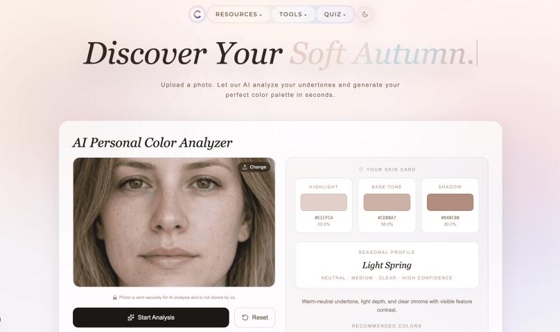
Which Blue Suits Your Skin Tone? A Seasonal Color Guide
The colors that go with blue change depending on your personal coloring — specifically your seasonal color type. In seasonal color analysis, your skin undertone, contrast level, and natural coloring determine which specific shade of blue flatters you most and which companion colors create the best harmony.
If you have ever tried a shade of blue that looked incredible on a friend but washed you out, the answer is probably seasonal mismatch. A Soft Autumn wearing icy blue looks tired. A True Winter wearing dusty blue looks bland. The shade of blue matters as much as the colors you pair it with.
- Muted seasons (Soft Autumn, Soft Summer) look best in dusty, greyed blues — think denim, slate, and dusty blue. These low-saturation tones harmonize with muted skin coloring rather than overpowering it.
- Clear seasons (Bright Spring, Bright Winter) look best in saturated, vivid blues — cobalt, royal blue, and electric blue. These high-clarity tones match the natural contrast and vibrancy of clear skin coloring.
- Deep seasons (Dark Autumn, Dark Winter) wear rich, deep blues best — navy, midnight blue, and marine. The depth in these blues matches the depth in their natural coloring.
- Light seasons (Light Spring, Light Summer) look best in pale, gentle blues — powder blue, sky blue, and periwinkle. Heavy dark blues can overwhelm their naturally delicate coloring.
- Blue Outfit Ideas by Color Season
The best blue outfit is one where the shade of blue and its companions both match your seasonal palette. Here are four formulas — one per season archetype — that show how the colors that go with blue shift based on your personal coloring.
Notice the pattern: warm seasons pair blue with warm companions (cream, gold, terracotta), while cool seasons pair blue with cool companions (white, silver, lavender). This is the principle behind seasonal color analysis — your best combinations always match your undertone.
How to Style Blue for Every Occasion
Blue works for every setting — the key is choosing the right shade and pairing it with colors that go with blue at the appropriate formality level.
- Casual Weekend: Medium blue denim with a cream or white tee is the easiest starting point. Add sage green, terracotta, or mustard as an accent through a jacket, bag, or sneakers.
- Work & Office: Navy is your power blue. Pair with crisp white, warm grey, or blush pink for a polished look. A navy blazer with grey trousers and a white blouse is universally professional.
- Evening & Date Night: Cobalt or royal blue commands attention. Pair with silver or gold metallics depending on your undertone. A bold blue dress with metallic heels and minimal jewelry is striking.
- Wedding Guest: Powder blue or dusty blue are safe choices that photograph beautifully. Pair with blush pink, soft lavender, or warm peach accessories. Avoid navy if the dress code says cocktail — it can read too dark in photos.
Blue in Home Decor: Best Color Pairings
The colors that go with blue in interior design follow the same color theory principles as fashion — but the proportions shift. In a room, blue often serves as the dominant color (walls, sofa, or rug) with companion colors playing supporting roles.
Navy walls pair beautifully with warm cream furniture, brass fixtures, and terracotta accents. This combination creates a cozy, grounded space without feeling dark. Add warm wood tones through shelving or flooring to prevent the room from feeling coldcolors that go with blue..
Light blue bedrooms feel most serene when paired with white linens, soft grey furniture, and touches of blush pink or lavender. Keep metallic accents in brushed nickel or silver to maintain the cool calm.