Optional fields look harmless when designing a product.
They give users more control without forcing them to provide extra information. The assumption is simple: people who need the field will use it, and everyone else can ignore it.
But an empty optional field does not always mean the user has no need for it.
Sometimes it means the product has not made the value clear enough.
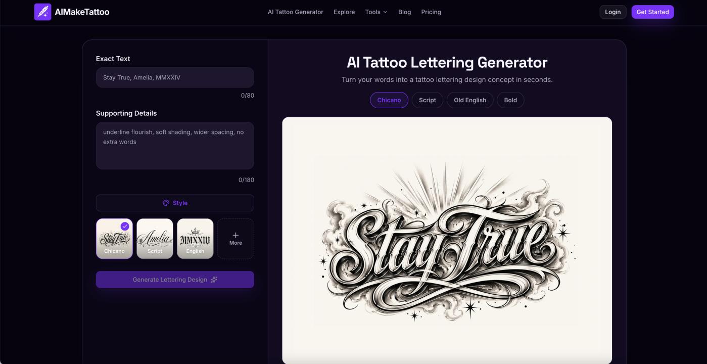
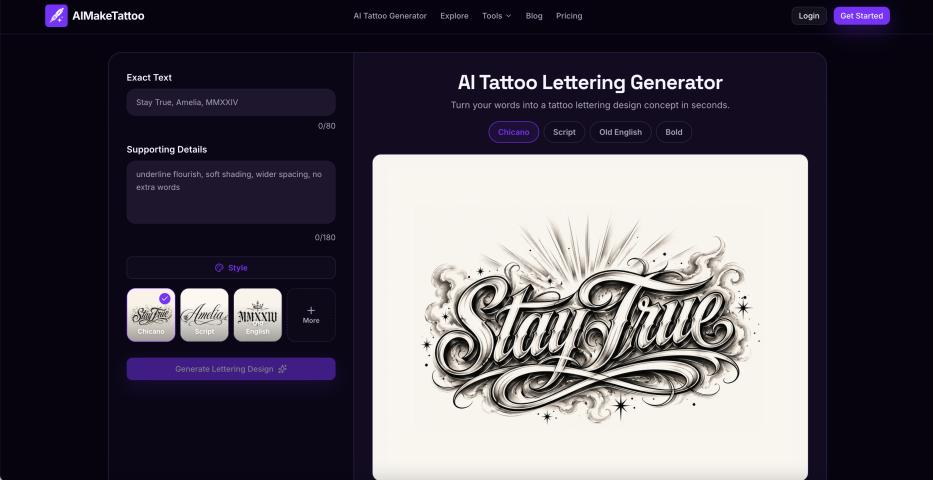
I recently noticed this while reviewing how people used an AI tattoo lettering tool I am building.
The workflow contains two main inputs:
Exact Text
This is the name, date, initials, phrase, or Roman numeral sequence that should appear in the image.
Supporting Details
This optional field can describe visual preferences such as spacing, shadows, flowers, flourishes, framing, or overall composition.
One logged-in user entered the same Roman numeral text several times and generated multiple versions using different lettering >
They tried Old English, Blackletter, and Chicano-inspired lettering.
But they never entered anything in Supporting Details.
The user was clearly interested enough to continue generating and comparing results. This was not a one-click visit.
The interesting question was why the optional field remained empty.
Several explanations were possible:
- The user only wanted a clean lettering design
- They did not know what kind of details to write
- They did not want to spend time composing instructions
- They expected the selected >
- They wanted the product to suggest ideas automatically
Each explanation points toward a different product decision.
If users genuinely prefer simple lettering, the field may not need more attention.
If they do not understand what to write, the interface needs clearer examples.
If writing feels like too much effort, the product may need lightweight presets.
If users expect greater variation from >
The behavior itself does not provide the final answer.
But it reveals the question that should be investigated.
## Empty fields are ambiguous signals
Product analytics often show whether a field was completed.
They do not explain why it was skipped.
An empty field can mean:
- no need
- no understanding
- no motivation
- too much effort
- unclear wording
- fear of making the wrong choice
Treating all empty fields as “users do not want this feature” can lead to the wrong conclusion.
The safer interpretation is:
The user did not find enough reason to complete the field in its current form.
That is a much more useful product question.
## Placeholder text may not be enough
The Supporting Details field already included example text.
It suggested ideas such as:
- underline flourish
- soft shading
- wider spacing
- no extra words
From the product builder’s perspective, this looked clear.
But example text still requires the user to do several things:
1. Understand what the examples mean
2. Decide which ones fit the desired result
3. Imagine additional possibilities
4. Type or edit a description
A user who only wants to see what happens may not do that work.
The problem is not necessarily that the field is confusing.
It may simply ask for more creative effort than the user wants to provide at that moment.
## A smaller intervention may work better than adding AI
The obvious solution would be to add another AI feature that generates Supporting Details.
But that would introduce:
- additional latency
- more API cost
- unpredictable suggestions
- another loading state
- more product complexity
A simpler first experiment is a >
For example, when Chicano lettering is selected, the tool could suggest:
soft drop shadow, controlled underline flourish, wider spacing, no extra words
For Old English:
balanced ornamental capitals, subtle shadow, wider character spacing, no frame
For Blackletter:
sharp angular strokes, restrained flourishes, strong vertical rhythm, minimal decoration
The user could accept the suggestion, edit it, or click again for another direction.
This reduces the burden of starting from an empty box while preserving user control.
## Random should still be relevant
A dice icon may appear to be a simple solution.
But purely random suggestions can make the product feel inconsistent.
A rose-and-smoke composition may suit one lettering >
The better approach is constrained randomness.
The tool can randomly select from a small pool of suggestions that are already compatible with the current >
This provides variety without producing arbitrary results.
## The real issue may be discovery, not capability
The product already supports detailed instructions.
The missing piece may be helping users discover what those instructions can do.
This is a common pattern in software.
A feature can technically exist while remaining practically invisible.
Users do not experience capabilities through documentation alone. They experience them through prompts, examples, defaults, and small moments of guidance inside the workflow.
A useful product does not only accept the correct input.
It helps users understand what a useful input looks like.
## Asking one user can be more valuable than guessing
Analytics can identify the behavior, but a short conversation can identify the reason.
A lightweight feedback email can ask:
When you left Supporting Details blank, was it because:
1. You only wanted clean lettering
2. You were not sure what to write
3. You wanted the tool to suggest ideas
4. Something else
Even one or two answers can prevent building the wrong solution.
This does not replace broader data.
But at an early stage, direct feedback can clarify ambiguous behavior faster than adding another dashboard.
## The product lesson
The main lesson is not about tattoo lettering.
It is about optional inputs.
Optional does not mean self-explanatory.
When users repeatedly skip an input, the next step should not automatically be removing it or making it required.
First ask:
- Does the user understand its value?
- Is the effort larger than the expected benefit?
- Does the blank state provide enough direction?
- Could a preset reduce the starting cost?
- Is the user expecting the product to make the decision?
The strongest product improvements are often not larger features.
Sometimes they are small interventions that help users move from an empty field to a useful first step.
I am currently testing this idea in AIMakeTattoo’s lettering workflow.
The goal is not to make users write longer prompts.
It is to help them explore more distinct visual directions with less effort.