Hero images give a landing page personality, but they also create one of the most common readability failures: text that looks clear on one crop and disappears on another. The problem gets worse across breakpoints, because the focal point, contrast, and amount of visible detail all change.
Start with the content hierarchy
Before editing the image, decide what must remain readable. Usually that means one headline, one short supporting sentence, and one primary action. If the image competes with all three, adding more shadows and outlines rarely fixes the underlying hierarchy. Reserve a quiet region for copy and keep detailed subjects away from that region.
Use blur as a controlled layer
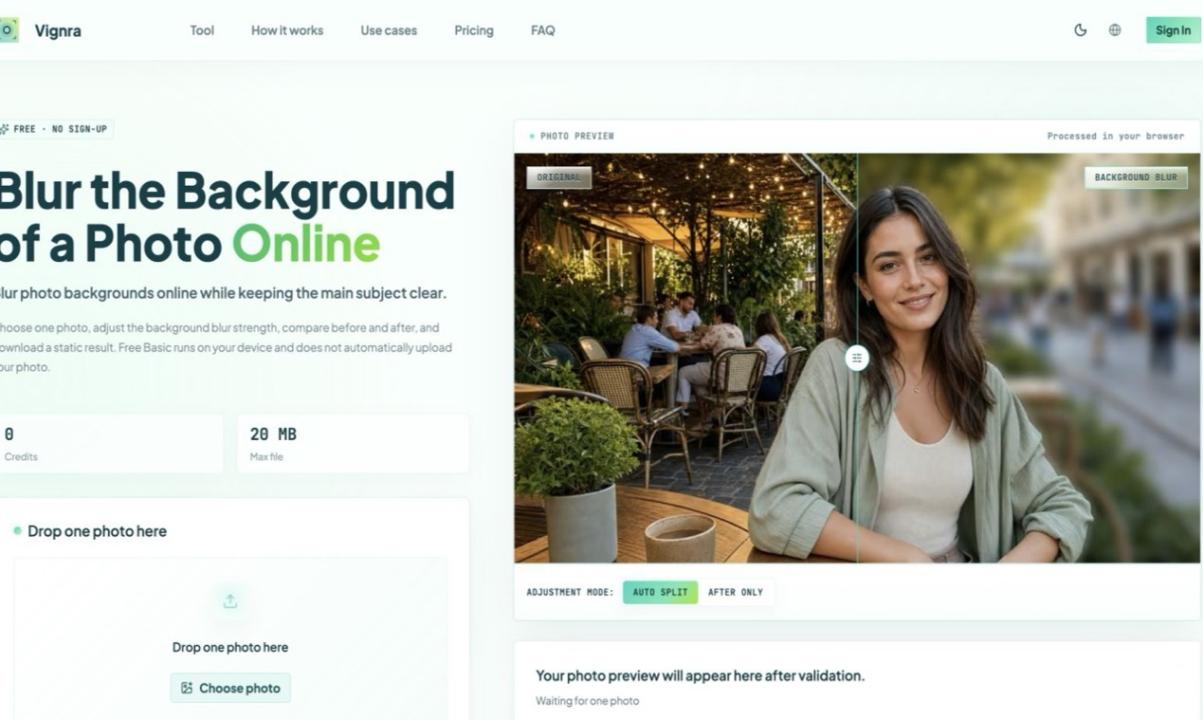
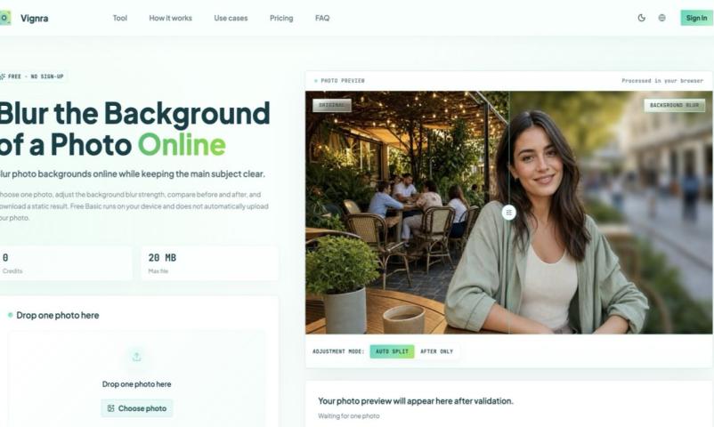
A blurred background can reduce high-frequency detail without destroying the color palette. The useful approach is selective: keep the product or subject sharp when it carries meaning, and soften the area behind the copy. If the source image is already busy, a browser-based tool such as Blur Background can create a softened version quickly for comparison. Treat the result as a working asset, then review it at the actual sizes your page uses.
Combine blur with a restrained overlay
Blur alone does not guarantee contrast. Add a subtle solid or gradient overlay between the image and the text. Dark overlays work well with light type, while a light wash can support dark type. Avoid pushing opacity so far that the image becomes decorative noise; the goal is separation, not concealment.
Test real responsive crops
Review at mobile, tablet, and desktop widths. A composition that works at 1440 pixels may place a face or bright object directly behind the headline at 390 pixels. Use focal-position controls or separate crops when necessary. Also test long localized headings, browser zoom, and increased text spacing.
Check accessibility and performance together
Measure text contrast against the final rendered background, including overlays. Because image pixels vary, sample the brightest and darkest areas behind the text rather than one convenient point. Export the finished asset at sensible dimensions and use modern formats where supported. Responsive source sets prevent a large desktop image from slowing a phone connection.
A practical review checklist
- The headline stays readable on every crop.
- The image still communicates its intended subject.
- The call to action is visually distinct.
- Contrast holds up under zoom and text resizing.
- The delivered file is appropriately compressed.
The best hero background is not the most dramatic image in isolation. It is the image treatment that supports the page message, preserves the subject, and stays dependable when the layout changes.