
While the digital world races ahead, it becomes quite imperative to promise the freedom of working anytime from anywhere on all devices in a Web App. Responsive design is another way of ensuring technically and almost aesthetically perfect rendering of your website or app across desktops, tablets, and mobile phones. Working in React JS, one can harness the powers of responsive design to engage more audiences and get bigger exposure. This post will lead you through the tricks, means, and best practices for building a responsive UI with React JS and, ultimately, give you wings to create that one-of-a-kind modern web experience.
Understanding Responsive UI
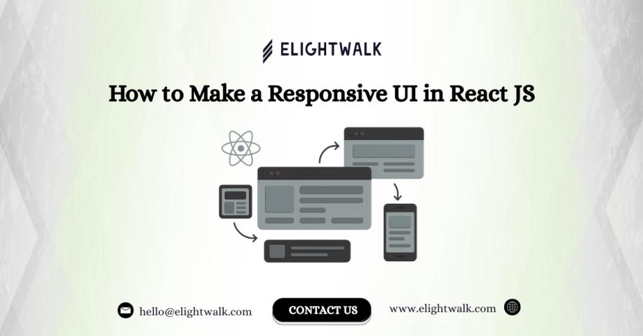
Responsive UI adapts layout and components based on the device’s screen size, orientation, and capabilities. The goal is to create interfaces that are easy to use and visually appealing, regardless of how or where users access them.
Key Principles of Responsive Design
- Flexibility: Use flexible grids and layouts to allow UI elements to resize efficiently.
- Media Queries: Apply CSS to configure the layout depending on device specifications.
- Mobile-First Approach: Give importance to the mobile experience before moving to bigger screens.
- Touch-Friendly Interactions: Optimize navigation and controls for touch-based devices.
Tools and Techniques for Responsive React UIs
React JS, by itself, does not enforce responsive design, but its ecosystem offers robust solutions. Here are essential techniques to achieve responsiveness in React apps:
1. CSS Media Queries
Media queries are foundational for responsive web development. Place your CSS in global >
Css /* Example: Responsive navbar */ @media (max-width: 600px) { .navbar { flex-direction: column; } } |
You can use these CSS breakpoints in your React project by importing the CSS files or using >
2. CSS Frameworks and UI Libraries
There are plenty of libraries that offer ingredients to set up responsive components on the fly:
- Bootstrap: Use its grid system with the react-bootstrap package.
- Material-UI: MUI offers a Grid component and hidden utilities based on breakpoints.
- Ant Design: Provides layouts, grids, and responsive utilities.
These libraries accelerate development and guarantee consistency.
3. Flexbox and Grid
CSS Flexbox and Grid layouts are a great way to provide flexible, adaptable layouts within your React components:
jsx |
Flexbox and Grid are native CSS technologies that allow you to control layout and alignment responsively.
4. Responsive Images and Media
Serve appropriate images for devices using the element, srcset, or other libraries (like react-responsive-picture). Always set images to max-width: 100% so they scale to the container they are in:
jsx |
5. React Responsive Utilities
Packages like react-responsive allow you to render separate components or layouts based on the device:
jsx |
6. Mobile-First Design in React
Design your layouts for mobile screens first, and then adapt/optimize them for larger devices. When working with >
7. Testing and Debugging Responsiveness
Leverage browser developer tools to simulate screen sizes and orientations. Use tools like BrowserStack or responsive design mode in Chrome/Firefox to catch issues early.
Best Practices for Responsive React UIs
- Start with a fluid grid system: Use percentage-based widths and scalable units (em, rem, vw, vh).
- Minimize fixed widths: Allow elements to stretch or shrink as appropriate.
- Prioritize content: Make key information above the fold, for smaller screens in particular
- Optimize performance: Compress assets, minimize bundle size, and defer non-critical resources for faster load times.
- Continuous testing: Check on real devices and emulators before launch.
Conclusion
Designing Responsively with React JS is a mix of art and scientific reasoning that entails knowledge of CSS, skillful use of libraries, and the enabling capabilities of React, to produce web applications that work well on any screen. Following the methods above gives you the starting point for correctly developing controlled, responsive interfaces that your users will benefit from.
If you want to elevate your next project with world-class talent, you know where to hire reactjs developers. The expert team at Elightwalk is here to help you build responsive, high-performing React JS applications that are built for success in today's marketplace.