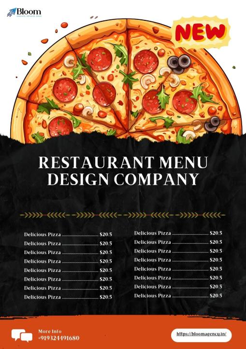

A menu card is more than just a list of dishes—it’s a first impression, a teaser for the culinary experience that awaits. In a world where diners scroll menus online, snap photos of their meals, and share every detail on social media, a creatively designed menu can make your brand unforgettable. Here’s how to make your menu card as appetizing as the food itself.
1. Understand Your Brand Identity
Your menu should reflect your restaurant’s personality. Is it casual, chic, rustic, or avant-garde? Colors, typography, and layout all convey a mood:
- Minimalist and Modern: Clean lines, white space, subtle typography.
- Rustic and Cozy: Hand-drawn illustrations, earthy tones, textured paper.
- Luxury Dining: Gold foiling, embossed lettering, elegant serif fonts.
Every design choice should reinforce the story your restaurant tells.
2. Play With Layout and Structure
A traditional columned menu isn’t the only way. Consider creative layouts:
- Visual Hierarchy: Highlight signature dishes with larger fonts or icons.
- Sections With Personality: Add playful headings like “Chef’s Faves” or “Secret Specials.”
- Interactive Elements: Fold-outs, sliders, or QR codes linking to detailed descriptions or food stories.
The goal is to guide the diner’s eye naturally and make the menu easy to scan yet delightful to explore.
3. Use Typography Thoughtfully
Typography communicates tone as powerfully as the words themselves. Combine fonts strategically:
- One font for headings (bold and eye-catching)
- One font for body text (legible, clean)
- Optional accent font for special dishes or quotes
Avoid overloading with too many fonts; simplicity often reads as more sophisticated.
4. Incorporate Visual Elements
Graphics, illustrations, and images can elevate a menu’s appeal:
- Icons: Indicate vegetarian, spicy, or chef’s specials.
- Illustrations: Hand-drawn sketches of dishes or ingredients add charm.
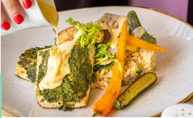
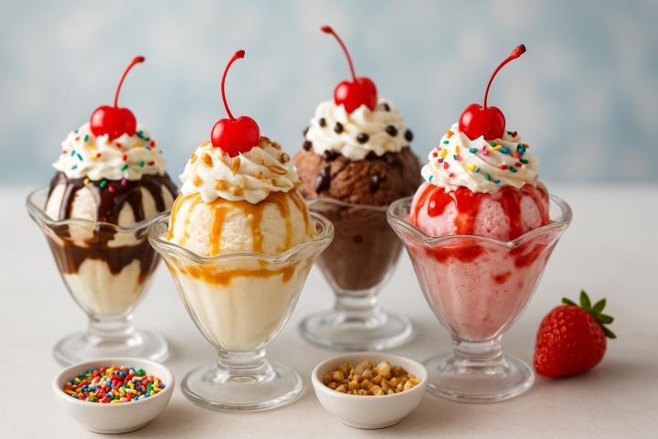
- Photos: Use sparingly—too many can feel cluttered. A single hero image can be impactful.
Consistency is key. All visual elements should align with your brand >.
5. Experiment With Materials and Formats
Menu cards don’t have to be paper-only. Think outside the napkin:
- Wood or Acrylic Boards for rustic or modern themes.
- Chalkboard Menus for casual or frequently updated menus.
- Foldable or Pocket-Style Menus for a tactile, interactive feel.
Even the texture, finish, and weight of your menu communicates a subtle message about quality.
6. Keep Readability Front and Center
No matter how creative, a menu must be readable:
- Contrast text and background for clarity.
- Keep font sizes accessible (especially for evening diners or large restaurants).
- Avoid overcrowding; white space is your friend.
A menu that confuses diners will leave a bad taste, even if the food is delicious.
7. Go Digital Without Losing Creativity
With digital menus becoming more common, your creativity doesn’t have to stop at print:
- Animated menus or interactive PDFs for online ordering.
- QR codes on tables linking to stylish digital menus.
- Social-media-ready designs that encourage sharing.
Digital design allows for dynamic updates without reprinting, keeping your menu fresh and timely.
Final Thoughts
A menu card is your silent salesperson—it can excite, delight, and convince diners to explore new flavors. By blending design, storytelling, and usability, a menu transforms from a static list into an experience that complements your culinary creations.
Remember: the best menu is one your diners want to look at before they taste, and remember after they’ve eaten.