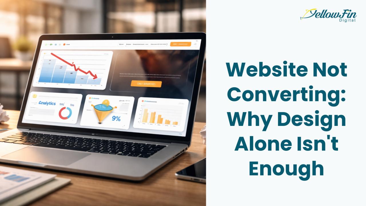

We've all been there. You launch a gorgeous website, clean lines, perfect color scheme, smooth animations. Everything looks premium. Everything feels modern. But when you check the analytics? Crickets.
Traffic is coming in. People are clicking around. But they're not buying, signing up, or filling out forms.
Here's the thing: working with a custom web design company should give you more than just eye candy. It should give you results. A beautiful website without strategy is just expensive wallpaper.
With WordPress themes, AI builders, and site-as-a-service platforms everywhere, we're drowning in design options. Most are built by professionals who've done the research. They know what looks good. But looking good isn't the same as getting results.
So why does your professionally designed website still feel like a ghost town?
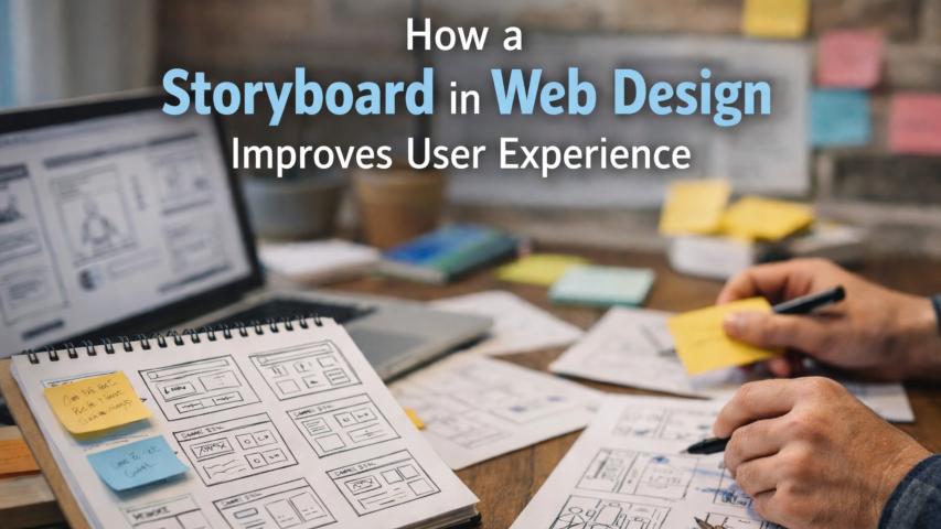
The Pretty Website Trap
There's a pattern that repeats itself dozens of times. A business drops serious money on a website that belongs in design portfolio. The photography is breathtaking. The typography is perfect. Everything screams "premium brand."
But then you actually try to use it. The value proposition? Buried on page three. The product benefits? Hidden behind marketing speak. The checkout process? Requires more information than a mortgage application.
Looking beautiful and working beautifully are two completely different things.
Where Most Websites Actually Fail
The Contrast Problem
Here's a mistake that is constant: businesses pull a color from their logo and slap it everywhere. Buttons, headings, icons, photo overlays, same treatment.
The problem? Without contrast, nothing stands out. Call-to-action buttons blend into backgrounds. Links disappear into text. Users can't tell what's clickable.
Try the squint test: Look at your website and squint until everything blurs. What stands out? If it's not your CTAs, forms, or "buy now" buttons, you've got a problem.
Proper contrast isn't just for accessibility, it makes calls-to-action clearer for everyone. Sites failing basic contrast can see conversion rates drop significantly because users literally can't see what action to take.
Forms That Kill Conversions
That beautiful multi-step contact form asking for company name, job title, phone, email, address, budget, timeline, and referral source? It's killing your conversions.
Research shows 70% of online shopping carts are abandoned, and complex forms are a massive contributor. Every field you add is a friction point. Every piece of information you demand gives visitors another reason to bail.
But you can't just delete everything. You need information to follow up and close deals.
The smart approach: Ask only what's essential. If your next step is always email, why ask for phone numbers? If you're not mailing anything, why need a full address?
Focus ruthlessly on the minimum needed to create a qualified lead. Every extra field should justify its existence or get cut.
Mismatched Messages Kill Conversions
Most websites treat every visitor like they're ready to buy right now. Big mistake.
Think about how you browse. Sometimes you're just poking around, checking options, reading reviews. Other times you've done your research and just want to buy already.
Imagine casually browsing and BAM, aggressive "Buy Now" buttons everywhere. Feels pushy, right? You're clicking away fast.
The fix? Match CTAs to where people actually are.
For discovery mode, use softer options like "Learn More" or "See How It Works." But if they're on your pricing page, they know what they want. Hit them with "Get Started."
Watch behavior too. Someone scrolling past your first CTA isn't ignoring you, they need more convincing. Meet them where they are.
Speed: The Silent Killer
Want to destroy your conversion rate? Make people wait.
You click on a site and... nothing. Blank screen. Loading spinner. You wait. Then you bail.
Studies show 47% of people expect sites to load in two seconds or less. One extra second on mobile? You lose 20% of conversions.
That stunning 5MB hero image? Half your visitors never see it because they're already gone.
Quality custom web design services get this, creating visual impact without the wait. Animation techniques that elevate brand identity work great when optimized. Every second you save directly boosts conversions.
Quick wins:
- Compress images (you won't notice the difference)
- Enable browser caching
- Use lazy loading for below-the-fold images
- Minimize JavaScript and CSS bloat
The Trust Gap You Didn't Know Existed
Users form their first impression of your website in less than a second. In that split second, their brain is making a critical judgment: can this site be trusted?
Design plays a role here, sure. But trust goes way deeper than visual polish.
Building Real Credibility
People want proof that you're legitimate. They want to see that other people have used your product and lived to tell the tale.
What actually builds trust:
- Real customer testimonials with actual names and photos
- Security badges and SSL certificates
- Clear return and privacy policies
- Transparent contact information
- Case studies with measurable results
Generic five-star ratings with no context? Everyone sees through those now.
But here's something fascinating: users can develop what researchers call "trust blindness" when you overuse the same trust signals. Showing the same company logo three times on one page? By the third appearance, their brain literally stops processing it.
Variety is key. Rotate between customer reviews, industry certifications, security badges, and client logos throughout the user journey.
Mobile Isn't Optional Anymore
Over 60% of web traffic now comes from mobile devices. If your site isn't optimized for phones, you're not just missing out on mobile conversions, you're missing out on most conversions, period.
"Mobile-friendly" doesn't mean "technically viewable on a phone." It means your site actually works on a small screen:
- Buttons are thumb-sized and easy to tap
- Forms are simple to fill out without zooming
- Navigation makes sense with one hand
- Text is readable without pinching
Google ranks sites based on their mobile version first now. So even your desktop traffic depends on your mobile experience being solid.
Testing: Because Guessing Is Expensive
Here's a humbling truth: you don't know what works until you test it.
HubSpot once increased conversions by 21% just by changing a button from green to red. That's not because red is inherently better, it's because for their specific audience, on that specific page, at that specific time, red performed better.
You can't predict this stuff. You have to test it.
What to test:
- Headlines and copy
- CTA button colors and text
- Form field quantity
- Image choices
- Page layouts
Markets shift. User expectations evolve. What worked last quarter might be tanking your numbers today. Build a culture of continuous testing and iteration.
Turn Design Into Revenue With a Custom Web Design Company That Builds to Convert
A great website isn’t just something you admire, it’s something that actually helps your business grow. That’s why working with a custom web design company matters. It’s not about fancy visuals or trendy layouts; it’s about creating a site that feels clear, fast, trustworthy, and easy to use.
When design is guided by real strategy and user behavior, people don’t just visit your website, they take action. If your site looks polished but isn’t converting, chances are it was built to impress, not to perform.
Whether you’re looking for a web design company near me or questioning if your current site is doing enough, remember this: good design should make things simpler, not smarter. Partner with a custom web design company that understands how people think, click, and decide, and let your website finally start pulling its weight.