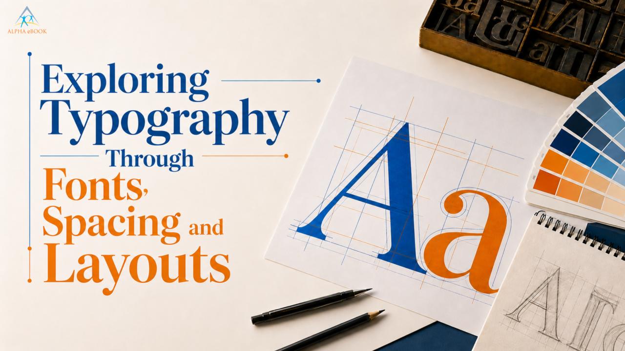
You need certain elements to catch your audience’s attention, but to keep it, you need quality design. While tracing letters or considering the spaces between lines and the edges of the pages is not on the reader’s radar when engrossed in reading, these elements of design need to be addressed to create a quality reading experience.
An outstanding reading experience is founded upon the artistry of typography, complemented by great book composition and typesetting. The design of an experience is its foundation.
Typography, micro-spacing, and systematic design are the elements that create the magic that helps take a cluttered and chaotic manuscript and transform it into a masterpiece that becomes an immersive work of art, no matter what medium, physical or digital.
The Mechanics of Modern Page Design
The primary step in transforming a text document into a published book is laying the structural groundwork. Designers need to sketch the page geometry before wasting time on font samples.
The layout artist establishes a text block, including typesetting rules, based on standard compositional principles and balances the inner and outer margins. Headings and footnotes are placed properly.
Designing a page involves placing text on an invisible grid to provide order to a manuscript and a pleasing design to each page. When a page's text is not aligned with the previous or subsequent page, it disrupts the design and becomes a distraction for the reader.
1. Choosing the Right Typeface
With the page grid locked in, the book's visual identity begins to emerge. Choosing a font is one of the most important design decisions you will make, as it really sets the tone of the story. The decision must take into account the publication's design aesthetics. Respected in the publishing industry. Most classic literary fiction titles are set in classic serif types like Garamond, Sabon, or Caslon. The little decorative feet (serifs) on the typeface help lead the eye along the lines of text. This is good for long-form reading.
For modern non-fiction, business, or tech titles, sans-serif typefaces like Helvetica, Arial, or Lato are used to create a cleaner, more legible, and more modern look.
Designers can’t just think about paper design anymore; they have to think about digital typography trends, so texts are just as beautiful on high-resolution screens. Unlike static print layouts, digital books on e-readers must scale dynamically. A typeface that looks phenomenal in a paper book may cause all sorts of digital design issues on a book reader, a mobile phone, or an E-ink screen.
2. Spacing and Layouts for Comfort
No matter how beautiful a typeface is, it will always be a failure if the spacing is off. Designers manipulate three variables to get perfect spacing:
Tracking: The consistent spacing throughout an entire string of text.
Kerning: The micro-adjustment of space between specific pairs of individual letters (like a capital 'V' next to a lowercase ' a ') to prevent awkward gaps.
Leading: The distance between baselines of successive lines of type.
Optimal adjustment of these factors provides the highest readability for the text. But if they're set too tight, people will start jumping lines. If they're too loose, the reading flow will break, and the blocks will be disjointed. What you want to do is remove all that mechanical friction so the structure is readable, the flow is seamless, and the reader's brain can process the content with ease.
The Crucial Distinction: Typesetting vs. Typography
In design, the terms "typography" and "typesetting" are often used interchangeably. To understand the construction of a page, it is useful to look at the types of design construction methods used in the industry to answer the following question: how does typesetting vary from typography?
One way to look at it is through the lens of art versus engineering. Typography is the artistic consideration of type design. It includes composition, placement, and the order of type with respect to the other elements of a design.
Typesetting comes after design. It is the construction of page layouts after the typography design and construction rules are set. Typesetting is especially important in design because the typesetter must build each page, construct page layouts, line text within the page margins, line each page completely to the set design, and ensure the text flows from page to page.
Advanced Formatting Secrets
During the typesetting phase, designers utilize advanced editorial layout techniques to manage the messy realities of raw text. A primary challenge is dealing with "widows" and "orphans." A widow is a lone, final line of a paragraph that gets pushed to the top of a brand-new page all by itself. An orphan is a single opening line of a paragraph left stranded at the bottom of a page. Both break the reader's concentration.
To fix these structural hiccups, designers use advanced text alignment strategies. Minor adjustments will be made to paragraph tracking by fractions of a percent, or to hyphenation settings. These minute changes pull a stray line back to the previous page or push an extra line forward. That means a seamless transition from one page to the next, while still keeping the book visually intact.
Elevating Your Final Manuscript
As the publishing landscape expands, modern book production demands a flexible approach. Authors can no longer look at paper and screens as competing formats. Instead, they have to synthesize the philosophies of traditional print and digital typography into a design strategy. A truly professional book must look flawless, whether it is held in a reader's hands as a heavy hardcover or downloaded instantly onto an iPad.
When the page's design and layout, and the text it contains, are balanced, the design becomes transparent. This requires extremely specialized software, extensive training, and the ability to see the smallest details.
For that reason, independent and self-publishing publishers use professional book typesetting services. It is an investment that helps publishers achieve a professional design standard and helps the book stand out in a competitive market.
In the end, the best book design is done so well, you don’t even notice it. Well-composed books have quiet fonts and unobtrusive margins. If a book is well-designed, the layout fades into the background, allowing the reader to focus on the author's words.