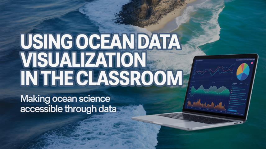
The deep blue ocean holds many mysteries, and the next decade promises incredible technological advancements that will revolutionize ocean exploration. From autonomous underwater drones to AI-driven mapping systems, the future..
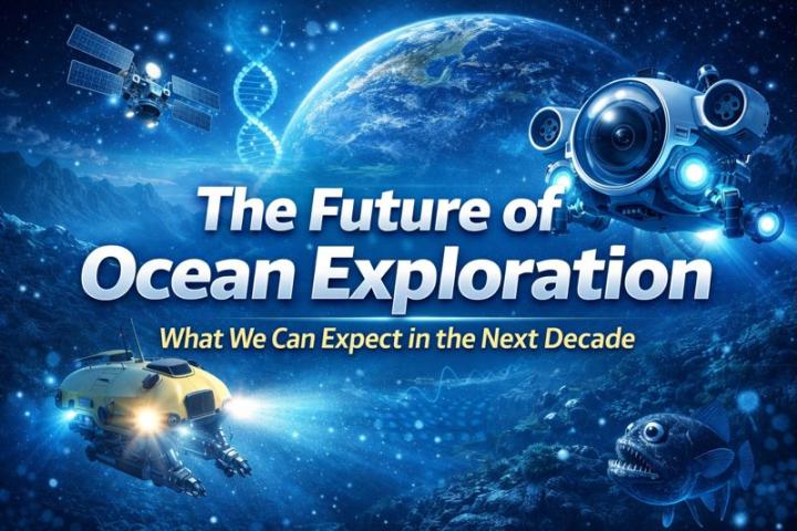
As the Earth’s climate changes, so does the power of our oceans. Warmer sea temperatures and shifting atmospheric conditions are combining to create bigger, stronger, and more frequent ocean storms...
As the Earth’s climate changes, so does the power of our oceans. Warmer sea temperatures and shifting atmospheric conditions are combining to create bigger, stronger, and more frequent ocean storms...
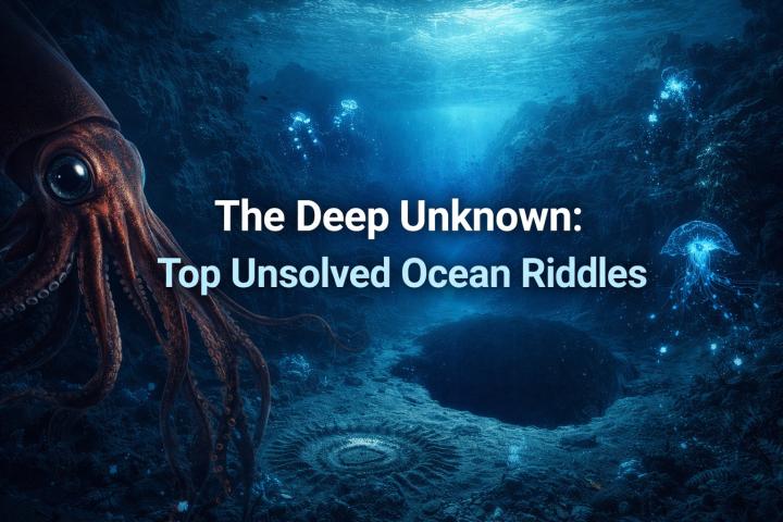
The ocean is vast, mysterious, and largely unexplored. Despite advancements in technology and marine science, the deep sea still holds many secrets. From unexplained phenomena to elusive creatures, the ocean..
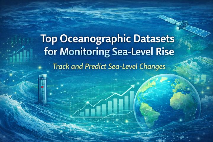
Sea-level rise is one of the most pressing consequences of climate change, with major implications for coastal communities and ecosystems. By 2035, many coastlines around the world are expected to..
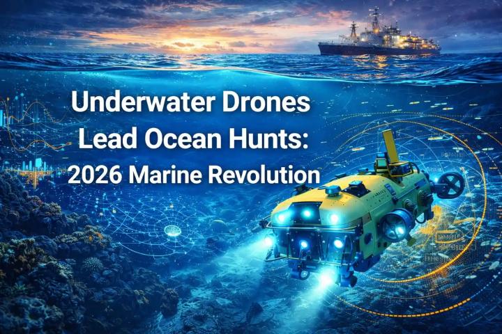
The oceans have long been a mystery, but with advancements in technology, the mysteries are becoming easier to uncover. In 2026, underwater drones are at the forefront of marine exploration,..
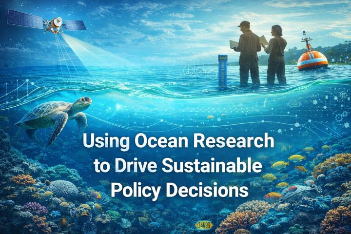
Ocean research plays a critical role in shaping sustainable policies aimed at protecting marine ecosystems and addressing climate change. By providing data on ocean health, biodiversity, and climate patterns, ocean..
Sea-level rise is one of the most significant indicators of climate change. The oceans are absorbing more heat and expanding, while melting ice caps and glaciers are contributing to rising..
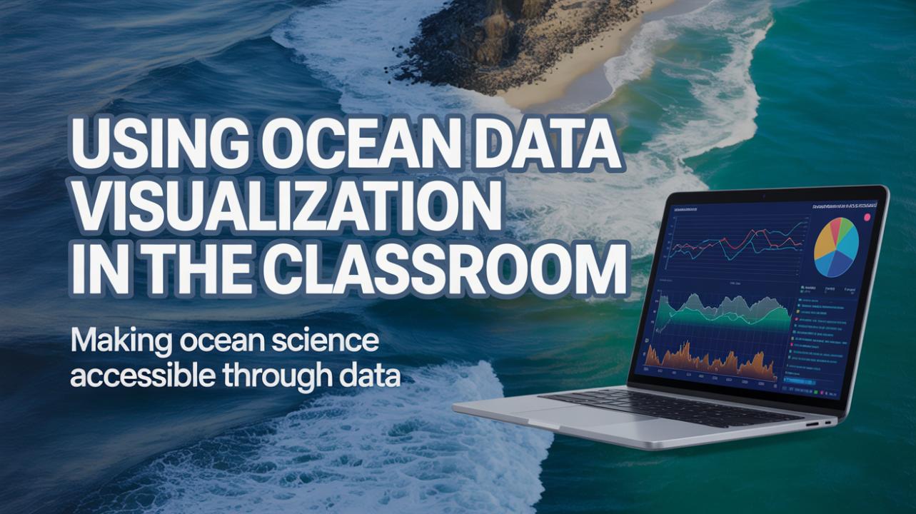
Ocean science is an exciting and crucial field of study, offering students the opportunity to explore marine ecosystems, climate change, and environmental sustainability. Oceanography.com provides comprehensive lesson plans for high..
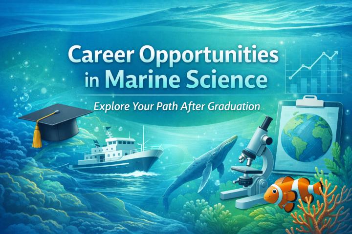
Marine science is a rapidly growing field with a diverse range of career opportunities. With the ocean playing a central role in climate regulation, biodiversity, and food security, the demand..
IntroductionEvery business wants to become data-driven. Organizations invest in analytics platforms, business intelligence tools, customer relationship management systems, and cloud infrastructure to gain better visibility into their operations. Yet despite..
Enterprises today operate in an environment where data flows continuously across cloud platforms, SaaS tools, IoT devices, and internal systems. While organizations have invested heavily in data lakes, warehouses, and..
The modern customer journey is a complex web of interactions across websites, mobile apps, social media, email, and physical stores. For years, businesses have struggled to piece together these fragmented..
In today’s data-driven world, companies are swimming in an ocean of information. Yet, without the right tools and infrastructure, that data remains untapped potential. That’s where Data Engineering Service comes..
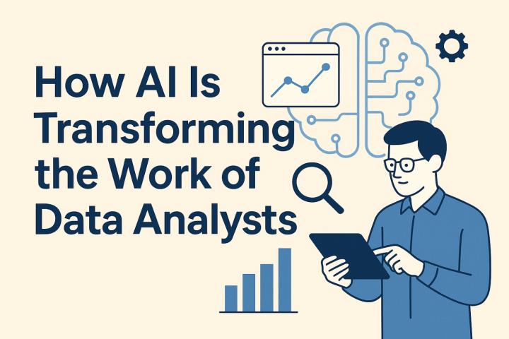
Artificial Intelligence (AI) is rapidly reshaping industries, and the field of data analysis is no exception. As AI technologies become more powerful and accessible, the role of data analysts is..
IntroductionImagine you open your favorite ride-sharing app. You check the estimated fare, track the driver’s location, and see the trip summary in real time. Ever wondered how all that information..
Data Loss Prevention Market Synopsis 2025:
The Data Loss Prevention Report offers an in-depth overview of this industry, summarizing essential findings such as market size, growth forecasts, and key trends...
In the rapidly evolving world of digital marketing, data analytics has become an essential tool for marketers seeking to optimize their campaigns. By harnessing the power of data, businesses can..