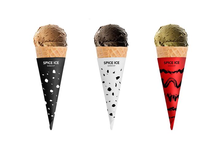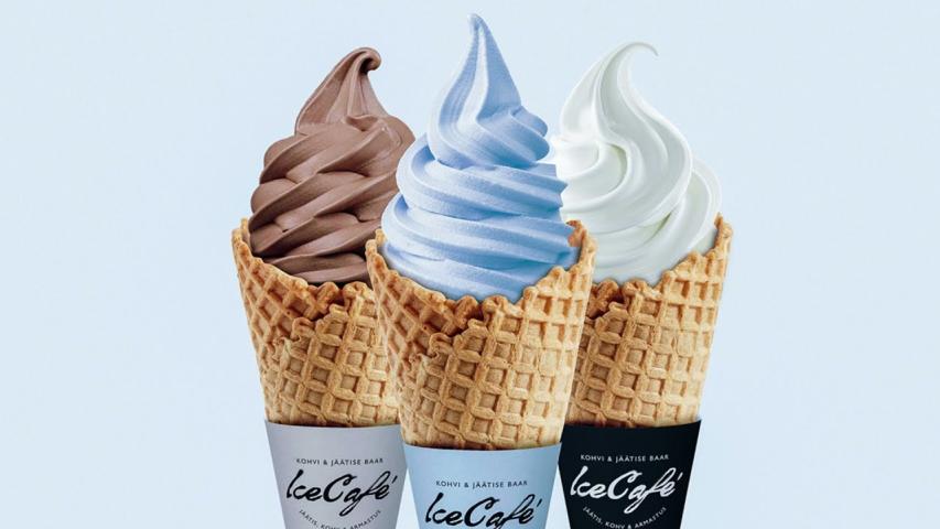

Ice cream packaging does more than protect a product. It can shape how customers see a brand, especially when the packaging stays in their hands throughout the eating experience. Custom Cone Sleeves give ice cream shops, dessert cafés, food trucks, and event vendors a simple way to combine practical protection with recognizable branding.
A well designed sleeve can help provide a better grip, reduce direct contact with the cone, and keep melting ice cream from making customers' hands messy. At the same time, it gives businesses a compact surface for logos, colors, slogans, seasonal artwork, or promotional messages.
1. Start With Your Brand Identity
Before choosing colors or illustrations, decide what you want customers to associate with your ice cream business.
A family focused shop might use playful graphics and bright colors, while an artisan gelato brand may benefit from a cleaner and more refined look. Your Custom Cone Sleeves should feel like part of the same brand customers see on your storefront, website, menus, and social media.
Consider using consistent:
Logo placement
Brand colors
Typography
Illustration >
Tagline or short brand message
Consistency makes packaging easier to recognize and prevents the sleeve from looking like a separate piece of marketing.
2. Make Your Logo Easy to See
Your logo is one of the most valuable elements on the sleeve, so avoid hiding it behind folds, overlaps, or the customer's hand.
Think about how people naturally hold an ice cream cone. The main branding area should remain visible when the customer is eating or walking around. A simple logo with enough surrounding space is usually more effective than a small logo surrounded by too many design elements.
You can also create a repeating logo pattern if your brand has a distinctive visual identity. However, make sure the primary logo remains obvious.
3. Choose Colors That Match the Product
Color has a major effect on how packaging feels. For an ice cream business, colors can communicate freshness, flavor, energy, or premium quality.
For example, pastel shades can work well for a boutique dessert brand, while stronger colors may suit a playful ice cream shop targeting families. Natural tones and kraft paper can support a more handmade or environmentally conscious visual direction.
Rather than filling the entire sleeve with multiple colors, select a controlled palette and make sure the text has enough contrast against the background.
4. Use Simple, Readable Typography
A cone sleeve has limited space. This means every word needs a purpose.
Choose fonts that remain easy to read when the artwork is curved around the cone. Decorative fonts can be useful for a short slogan, but they should not make important information difficult to understand.
Keep your most important message short. Depending on the business, this might be your brand name, slogan, website, social handle, or a seasonal promotion.
Remember that the sleeve will be viewed from different angles and distances. Clear typography usually performs better than complicated lettering.
5. Design Around the Cone Shape
One common mistake is designing the artwork as if the sleeve were a flat rectangular box. A cone sleeve has a tapered shape, so the final appearance can change significantly after it is wrapped.
Before approving the artwork, check:
The exact cone dimensions
Sleeve height and taper
Overlap or seam area
Bleed and trim areas
Logo position
Text placement
Keep important information away from areas that may be covered by the overlap. Testing a physical sample or digital mockup can help identify problems before a larger production run.
6. Add Creative Graphics Without Creating Clutter
Illustrations can make Custom Cone Sleeves more memorable, but too many graphics can make the packaging difficult to understand.
Instead of combining several unrelated images, choose one strong visual direction. You could use illustrated ingredients, an original pattern, simple geometric shapes, or artwork connected to your location.
For seasonal promotions, the same basic brand layout can be refreshed with new illustrations. This allows a shop to create summer, holiday, festival, or limited edition sleeves without losing its core identity.
7. Consider the Material and Printing Process
Good artwork cannot compensate for the wrong packaging material. The paper or board should suit the cone, printing requirements, handling conditions, and intended customer experience.
Food packaging materials require careful consideration because packaging components can come into contact with food. The FDA classifies packaging and materials that contact food as food contact substances and regulates them according to their intended use. Businesses should therefore confirm that their selected material, inks, coatings, and adhesives are appropriate for the intended food packaging application.
8. Add Useful Marketing Elements
Once the main design is complete, consider whether the remaining space can provide additional value.
A short call to action can encourage customers to interact with your brand. Depending on the business, you could include a social media handle, website, QR code, store location, or seasonal message.
For example, a QR code could lead customers to a loyalty program or online menu. Just make sure it is large enough to scan and placed on an area that remains relatively flat and visible.
This turns the sleeve from simple serving packaging into a small customer engagement tool.
9. Connect Your Cone Sleeves With Your Other Packaging
Your ice cream packaging should look like one complete brand system rather than a collection of unrelated designs.
If your business uses Custom packaging boxes with logo, for example, consider using the same colors, typography, logo treatment, and visual >
NexGen Boxes offers custom packaging solutions that can help businesses maintain a consistent branded packaging experience across different formats.
When customers see the same visual identity across multiple packaging items, the brand becomes easier to recognize. This is particularly useful for businesses that sell through physical locations, events, delivery services, or retail partnerships.
Conclusion
Designing attractive Custom Cone Sleeves requires more than choosing an appealing picture. The strongest designs balance brand identity, readability, cone fit, material selection, functionality, and customer experience.
A well planned sleeve can protect the customer's hands, support cleaner handling, reinforce your visual identity, and create another opportunity for customers to remember your business. By following these nine design tips, ice cream shops and dessert businesses can create packaging that looks professional while serving a practical purpose.