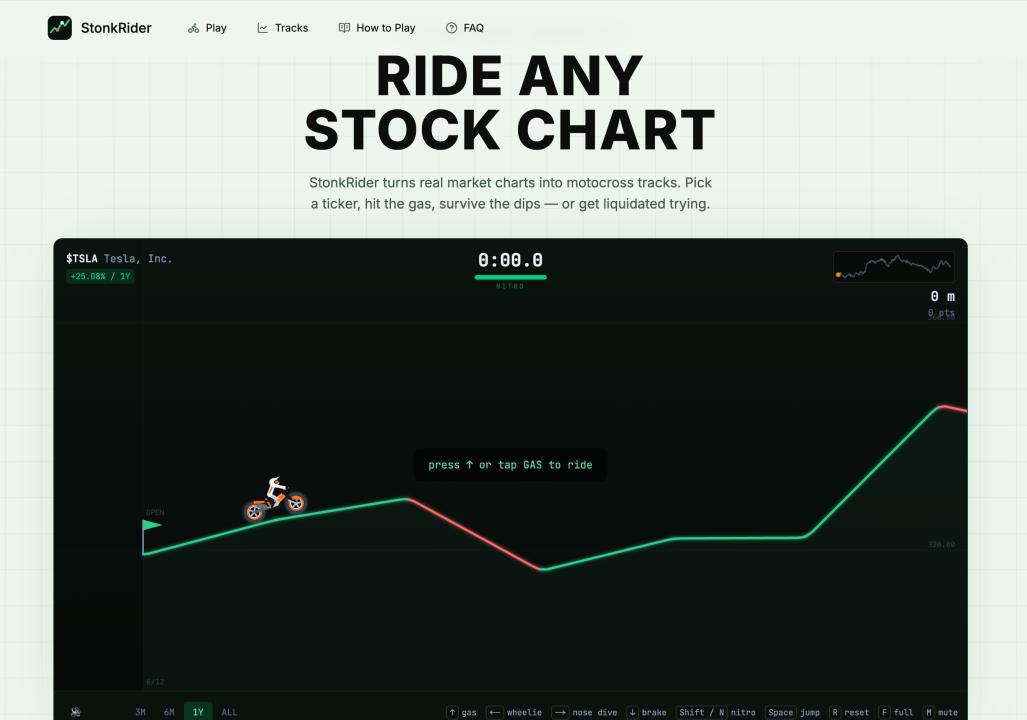
Stock charts are everywhere and almost nobody feels them. A line goes up, a line goes down — it's abstract until it's your money. I wanted to see if you could make market data visceral, so I built something deliberately ridiculous: a game that turns any stock's price history into a motocross track you ride.
Pick a ticker — a stock, an ETF, a crypto — and the game builds terrain from its actual daily closing prices. Rallies become ramps. Corrections become cliffs. You ride from market open to close, pulling flips and wheelies, trying not to crash on a bad week. It's called StonkRider, and underneath the silliness there's a real idea.
Abstraction is where engagement goes to die
People don't engage with abstractions; they engage with things they can feel. A spreadsheet of returns is forgettable. The same data as a track you physically survive or wipe out on is something you remember — and want to try again with a different ticker. The data didn't change. The format changed, and that's the whole game.
Constraints from real data make it better, not worse
It would have been easier to generate random terrain. But tying every bump to a real closing price is what makes it click — you recognize a crash as an actual cliff, a meme-stock spike as a launch ramp. Authenticity is the feature. When the underlying data is real, players bring their own context and stories to it for free.
The takeaway for anyone presenting numbers
This is a goofy game, but the principle is serious and it applies to dashboards, analytics, onboarding, and marketing: if you want people to care about a number, give it a body. Turn the metric into something they can see move, feel, or play with. The dry version is correct; the tangible version is the one that gets shared.
If you want to ride your favorite ticker's year — for better or worse — you can try it here: playstonkrider.com.
What's the best example you've seen of dry data made genuinely fun or intuitive?