
Most products treat the first 30 seconds as a chance to capture something — an email, an account, a tutorial completion. I built a small browser puzzle game and did the opposite: no signup, no account, no tutorial, no onboarding flow at all. You land on the page and you're already playing. It turned out to be the most important design decision in the project.
Friction compounds before value does
Every gate you put before the "aha" moment is a place users leave. A signup wall, a tutorial nobody asked for, a cookie banner stacked on a newsletter popup — each one is a small tax paid before the person has any reason to care. For a casual product, that tax is fatal. People don't push through friction for something they haven't experienced yet.
One mechanic, explained by playing
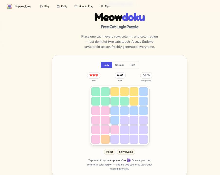
The game (it's called Meowdoku — place cats on a grid so none share a row, column, or region, and none touch) has exactly one rule. No numbers, no math. I was tempted to write a tutorial; instead I made the first puzzle so simple that the rule teaches itself in two or three taps. The product explains itself by being used, which is the only explanation people actually absorb.
The lesson transfers to serious products too
This isn't just a games thing. The same instinct — let people reach value before you ask for anything — applies to SaaS onboarding, to free tools, to demos. Can someone experience the core value of your product before they create an account? If the honest answer is no, that's usually a friction problem disguised as a "we need their email" problem.
Defaulting to "no signup until there's a reason" forced me to make the core experience strong enough to stand on its own. That's a healthy constraint for almost any product. If you want to feel what zero-friction onboarding is like, you can just start playing: meowdoku.run.
Where's the line for you — what's the one thing you'll gate behind signup, and what do you let people try for free first?