Hybrid heating systems are often discussed in terms of efficiency ratings, equipment compatibility, and energy savings. Rarely do conversations focus on user experience. Yet for homeowners, UX is where hybrid systems most often fail. Not because the technology is incapable, but because the way people interact with it is confusing, fragmented, and misleading. When comfort problems arise, the issue is rarely obvious, and the interface gives little help in understanding what is actually happening.
This disconnect becomes clear when systems appear to function normally on screens while comfort tells a different story. Many of the most frustrating homeowner complaints align with known Hybrid Heating System Errors, where multiple systems technically operate but fail to coordinate. The UX problem lies in how little visibility users have into these coordination failures, even though they are the ones living with the consequences.
Hybrid Heating Is Technically Advanced but Experientially Primitive
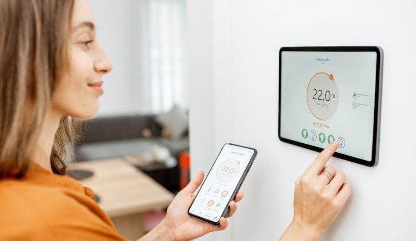
From a technical standpoint, hybrid systems are complex. They combine different heat sources, switching logic, sensors, and control rules. From a user’s perspective, however, the interface is often a single thermostat screen or mobile app with limited feedback.
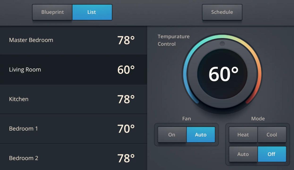
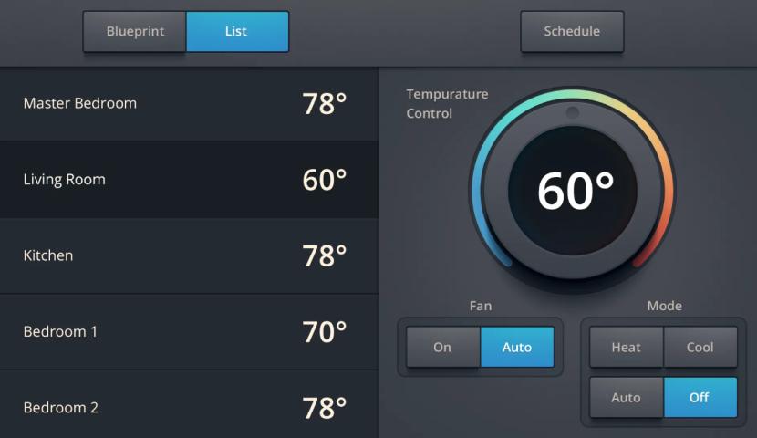
Most interfaces show only basic information:
Current indoor temperature
Target temperature
Heating on or off status
What they rarely show is:
Which heat source is active
Why a switch occurred
Whether the system is delaying, limiting, or protecting itself
How long recovery is expected to take
This creates a UX gap where users are expected to trust automation without being given the context needed to understand it.
When “Heating On” Doesn’t Mean Heat Is Being Delivered
One of the most common UX failures in hybrid heating is the misleading status indicator. When the thermostat says “heating,” users reasonably assume heat is actively being delivered.
In reality, several other states may exist:
The system is waiting due to minimum run-time rules
The primary heat source is unavailable or limited
The system is evaluating whether to engage backup heat
A protection cycle is delaying output
None of this is communicated clearly. From the user’s point of view, the system is “on” but the house is still cold. This erodes trust and leads to unnecessary manual overrides that often make performance worse.
UX Assumes the User Doesn’t Need to Understand the System
Many hybrid heating interfaces are designed with the assumption that less information equals better usability. While simplicity is valuable, oversimplification becomes a problem when systems behave unpredictably.
Hybrid systems make decisions that affect comfort and cost. Users are not given insight into those decisions, nor are they informed when the system is operating in a degraded or transitional mode.
This creates a poor feedback loop:
The system changes behavior
The user notices discomfort
The interface provides no explanation
The user intervenes blindly
Instead of empowering users, the UX leaves them guessing.
Multiple Systems, One Interface, No Clarity
Hybrid systems often involve equipment from different manufacturers. Each component may have its own logic, but the user interface attempts to flatten everything into a single experience.
This flattening hides important distinctions:
Primary vs backup heat
Efficient vs high-cost operation
Normal vs exception states
Without these distinctions, users cannot make informed decisions. They don’t know whether to wait, adjust settings, or call for service. The system feels opaque rather than intelligent.
UX Fails During Edge Cases, Not Normal Operation
During mild weather, most hybrid systems appear to work fine. UX problems surface during edge cases:
Extreme cold
Rapid temperature changes
Partial zone demand
Recovery from setbacks
These are precisely the moments when users need the most clarity. Instead, interfaces remain static, offering the same minimal information regardless of system complexity.
When comfort drops during these scenarios, users lose confidence not only in the interface but in the entire system.
The Cost of Poor UX Is Not Just Frustration
Poor UX in hybrid heating has tangible consequences:
Increased energy use from unnecessary overrides
Excessive reliance on expensive backup heat
Short cycling caused by manual adjustments
Premature wear on equipment
Because users don’t understand what the system is doing, they unintentionally work against it. A better UX could prevent many of these issues by guiding behavior rather than obscuring system state.
Smart Apps Prioritize Aesthetics Over Insight
Modern heating apps are visually clean and easy to navigate, but they prioritize appearance over actionable insight. Graphs and schedules look impressive, yet they often lack explanations tied to system behavior.
For example, an app may show increased runtime without explaining that the system is intentionally limiting output to protect efficiency. Users see a problem but not the reason behind it.
A good UX doesn’t just display data. It explains relevance.
UX Ignores the Emotional Side of Comfort
Heating is not a purely technical experience. Comfort is emotional. When people feel cold in their own homes, anxiety and frustration rise quickly.
Hybrid systems often respond to discomfort slowly by design, favoring efficiency. Without UX cues explaining this behavior, users perceive the system as broken or unreliable.
A simple message explaining why heat delivery is gradual and when comfort will stabilize could significantly improve trust. Most systems provide no such reassurance.
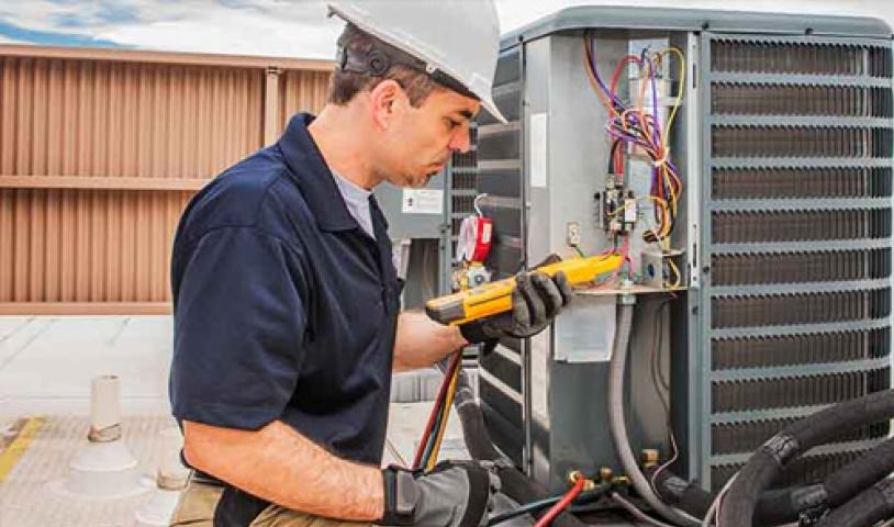
Professionals See the Gap, Users Live With It
HVAC professionals often understand why hybrid systems behave the way they do. Homeowners do not. The UX does nothing to bridge this gap.
When service calls happen, technicians frequently discover that the system is operating within design parameters. The real failure is that the user experience never communicated those parameters clearly.
This leads to unnecessary service visits and dissatisfaction, even when equipment is functioning correctly.
What Better UX in Hybrid Heating Could Look Like
Improving UX does not require overwhelming users with technical detail. It requires meaningful transparency.
Better UX would include:
Clear indication of which heat source is active
Simple explanations for delays or transitions
Alerts when the system enters protection or limitation modes
Guidance on when user intervention helps or hurts
Contextual messaging during extreme weather
These elements would transform the system from a black box into a cooperative tool.
Why UX Must Be Part of HVAC Design
As residential HVAC becomes more complex, UX can no longer be an afterthought. Hybrid systems demand interfaces that reflect system reality, not just desired simplicity.
Ignoring UX leads to systems that are technically impressive but practically frustrating. Addressing it improves comfort, efficiency, and long-term satisfaction.
Conclusion
The hidden UX problem in hybrid heating systems is not about bad screens or confusing menus. It’s about a lack of communication between the system and the person relying on it for comfort.
Hybrid heating failures are often blamed on technology, installation, or equipment compatibility. In many cases, the deeper issue is that users are left in the dark about what their system is doing and why.
Until UX is treated as a core component of hybrid heating design, these systems will continue to underperform in the one area that matters most to homeowners: lived experience.