Most early-stage teams do not need a complete brand campaign on day one. They need enough visual material to explain the product, make the launch page feel intentional, and learn which story resonates with the people they want to reach.
The expensive mistake is treating every visual asset as final. A founder writes a long brief, waits for a polished video, then discovers that users do not understand the core offer. A leaner approach is to test a small visual pack first: a short hero concept, a product-related motion clip, a social teaser, and a simple announcement visual. Each asset should communicate the same customer problem and outcome from a slightly different angle.
Here is a practical way to build that pack without turning early creative work into a months-long production project.
1. Start With One Launch Sentence
Before choosing a tool or writing a prompt, write the message a visitor should understand in one sentence.
For example: "Our product helps independent designers turn scattered client feedback into a clear revision plan." This is more useful than a feature list because it establishes the customer, the friction, and the outcome.
Use the sentence to guide every visual choice. If the hero video, social post, and launch copy all tell a different story, the launch will feel busy even if each asset looks good on its own.
2. Make Four Small Assets, Not One Huge Video
For most early launches, four focused assets create more learning than one elaborate film:
- A hero motion concept: a short, quiet visual that supports the landing-page headline.
- A problem-to-outcome clip: a six- to ten-second scene that makes the user's before-and-after easier to picture.
- A product-adjacent visual: an image or animation that introduces the product category without inventing exact UI behavior.
- A social teaser: a vertical version with one hook and one next step.
These assets can share a setting, color direction, or visual motif. They should not all repeat the same shot. The goal is to test which entry point makes the product easiest to understand.
3. Use Generation for Concepts, Then Add Product Truth
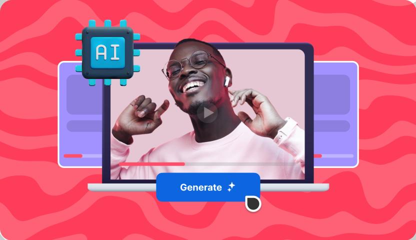
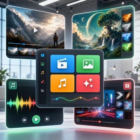
VideoWeb AI can help teams make these early creative drafts in one place: Seedance 2.0, text-to-video, image-to-video, reference-to-video, and music-video workflows give founders several ways to start from the same brief.
For a product whose real interface is still changing, begin with a visual metaphor rather than a fake screen recording. A project-management tool might show the movement from scattered notes to one ordered workspace. A creator tool might show a rough idea becoming a clear sequence of publishable assets. Keep the metaphor simple enough that it supports the message instead of distracting from it.
Once a direction works, use real screenshots, approved copy, and accurate product details in the final launch version. AI-generated visuals are useful for exploring a story; they are not a substitute for showing what the product actually does.
4. Write Prompts Like a Brief, Not a Wish List
A launch visual needs a job. Give it one.
Job: introduce the user problem in the first two seconds.
Subject: a solo founder organizing scattered customer notes.
Action: notes move from several sources into one calm, ordered workspace.
Camera: slow overhead push-in.
Setting: clean desk, late-afternoon light.
Mood: focused, practical, optimistic.
Avoid: readable fake UI text, invented logos, extra people, or dramatic effects.
Format: 16:9, 8 seconds.
The prompt does not describe every frame. It defines what the viewer should understand, then gives the generator one subject, one movement, and clear boundaries. This makes the result easier to compare against the launch brief.
5. Review the Pack as a User Would
Before publishing, look at every asset beside the landing-page headline. Ask:
- Can a new visitor identify the customer problem?
- Does the visual make the promised outcome clearer?
- Is the product still recognizable when exact product details are needed?
- Did any generated text, image, feature, or claim become misleading?
- Does the social teaser give people a clear reason to visit the launch page?
If the answer is unclear, change the story before investing in more production. The best time to find out that a message is confusing is while the asset is still a small concept.
A Launch Pack Is a Learning Tool
The point of a pre-launch visual pack is not to look larger than the company is. It is to make a focused promise, give potential users something concrete to react to, and help the team choose which direction is worth finishing.
Founders can start with a single written brief, turn it into a few distinct visual concepts, and keep the version that makes the product story simplest. For teams that want text, image, reference, and music-driven options in the same creative workflow, explore VideoWeb AI and use the early drafts to inform the final launch assets.