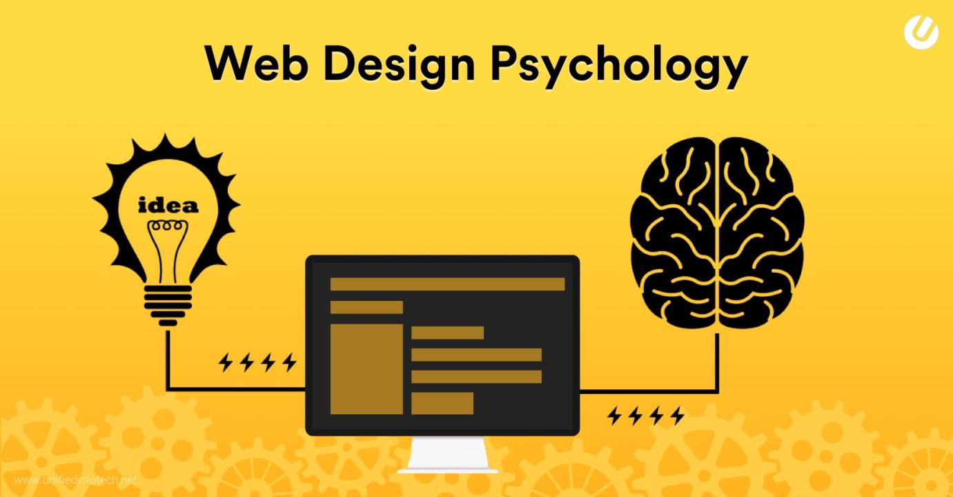

Ever wonder why some websites just feel right the moment you land on them? It’s not magic—it’s psychology. Great web design taps into how people think and feel so that every color, button, and layout decision helps users stay longer, click more, and trust faster. Whether you’re designing your own site or working with a team like Web Design Sacramento, knowing the psychology behind design can seriously level up your results. In this post, we’ll break it all down in plain English so you can start making smarter, more user-friendly choices.
Why Psychology Matters in Web Design
Websites are made for people, and people don’t always think the way we expect. Psychology helps us understand how users think, feel, and make choices online. A good design speaks to the brain and emotions at the same time. If a website is hard to use or confusing, people leave. But if it feels easy and clear, they stay, explore, and often take action. That’s the power of using psychology in design.
Key Psychological Principles That Shape Great Design
Some design rules are based on how our brains work. Here are a few that matter most: Visual hierarchy: We look at bigger or bolder things first. Designers use size, color, and space to guide your eyes. Hick’s Law: Too many choices slow people down. Simple options make decisions easier.
Fitts’s Law: The closer and larger a button is, the easier it is to click. That’s why CTAs should be easy to reach. Color psychology: Colors make us feel different emotions. Blue feels calm. Red feels bold. Pick colors based on the message. Von Restorff Effect: When something looks different, we remember it. Use contrast to highlight what matters most.
How People Process Information on a Website
Most people don’t read every word—they scan. That’s why clear headings, short paragraphs, and bullet points help. If a page feels crowded, our brains get overwhelmed. This is called cognitive load. A clean layout makes the brain feel relaxed. First impressions also matter a lot. In just a few seconds, people decide if they trust your site. Good design makes a strong first impression fast.
Using Psychology to Increase Engagement and Conversions
You want visitors to stay and take action. Psychology can help:
Tell stories: Stories connect with emotions and make people care.
Build trust: Show reviews, logos, or awards to prove your value.
Use strong CTAs: Clear buttons with action words like “Get Started” work better than vague ones.
Use the Zeigarnik Effect: People remember unfinished tasks. So if they start a form or quiz, they’re more likely to finish it.
Common Web Design Mistakes That Ignore Psychology
Some designs push users away. Here’s what to avoid:
Too much clutter: Too many things on a page confuse the brain. Weak CTAs: If users don’t know what to do, they’ll leave. Inconsistent design: Switching > Forgetting mobile users: If it’s hard to use on a phone, people won’t stay.
Tips for Applying Psychology to Your Website
Here are some quick tips to make your site smarter:
Focus on one goal per page.
Use space to make things easy to see.
Keep menus and buttons simple and clear.
Use color and images to guide feelings.
Watch how users behave and adjust what’s not working.
Conclusion
Great web design isn’t just about looks—it’s about how it makes people feel and act. When you use simple psychology principles, your website becomes easier to use, more enjoyable, and more effective. Keep your users in mind, and let your design speak to their brains and hearts.