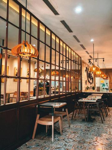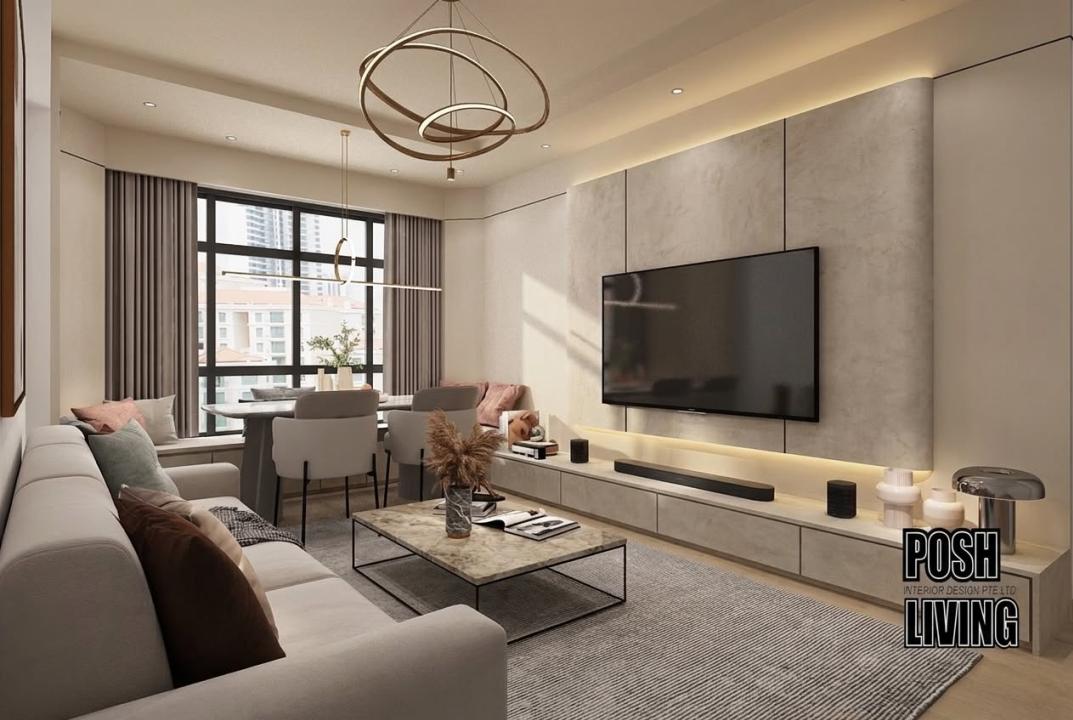
The best colour schemes for condominium interiors in Singapore combine warm neutrals, earthy tones, and considered accent colours. These palettes make compact spaces feel larger, more cohesive, and genuinely welcoming. Shades like warm white, greige, taupe, and terracotta work especially well in Singapore's high-humidity climate, complementing natural light and tropical surroundings without overwhelming a smaller floor plan.
Choosing the right colours is one of the most consequential decisions in condominium interior design in Singapore. Get it right and your home feels open, curated, and calm. Get it wrong and even a well-furnished condo can feel cluttered or cave-like. This guide walks you through the palettes, pairings, and practical logic that experienced interior designers use every day.
Why Colour Matters More in a Condo Than in a Landed Home
Most Singapore condominiums range between 500 and 1,200 square feet. In that footprint, colour does heavy lifting. A poorly chosen wall colour can visually compress a living room. The right one can make a 700 sq ft unit feel airy and generous.
There is also the light factor. Many condo units face specific orientations — north-facing units receive cooler, diffused light, while west-facing ones deal with harsh afternoon glare. Your colour palette needs to account for how natural light behaves in your specific unit at different times of day.
Warm Neutrals: The Most Versatile Condo Palette
Warm neutrals remain the most popular choice among condo interior designers working in Singapore. These include shades of off-white, warm beige, greige (grey-beige hybrids), and soft sand. They reflect light well, pair with almost any furniture finish, and age gracefully as trends shift.
What makes warm neutrals particularly effective in Singapore is their compatibility with timber accents and rattan furniture — materials that are widely used in tropical modern and Japandi-inspired interiors. The warmth in these tones prevents the space from feeling sterile or overly clinical.
Recommended Warm Neutral Combinations
Warm white + natural oak timber: Clean, light-filled, works well in north-facing units
Greige walls + off-white ceilings: Adds subtle depth without darkening the room
Soft sand + linen upholstery: Layered tonal look that feels intentional and relaxed
Warm beige + brushed brass fixtures: Elevates a standard condo into something that feels designed
Earthy Tones: Adding Character Without Closing In
Earthy tones — terracotta, clay, warm ochre, and muted sage — are increasingly popular in modern condo colour schemes. Used thoughtfully, they bring personality and grounding to a space. Used carelessly, they can make rooms feel heavy.
The key is restraint. In a typical Singapore condo, earthy tones work best as feature wall colours, in soft furnishings, or as cabinetry accents rather than across all four walls. A single terracotta feature wall in a bedroom, paired with warm white on the remaining three walls, creates warmth and focus without visual fatigue.
How to Use Earthy Tones Effectively
Apply to one feature wall only, particularly behind a bed head or TV console
Use in kitchen cabinetry paired with light stone countertops
Introduce through soft furnishings — cushions, throws, rugs — before committing to paint
Balance with natural materials like terrazzo, marble, and raw wood to avoid a muddy look
Modern Condo Colours: What Is Trending in Singapore Right Now
Current interior design trends in Singapore lean toward quiet luxury and biophilic aesthetics. Modern condo colours reflect this shift — less stark white, more nuanced tone-on-tone layering. Some of the most sought-after palettes currently include:
Colour Palette | Best For | Pairs Well With
|
|---|---|---|
Warm white + taupe | Open-plan living and dining | Light timber, linen, brushed metals |
Sage green + off-white | Bedrooms and studies | Rattan, dark walnut, ceramic accessories |
Terracotta + cream | Feature walls, dining areas | Terrazzo flooring, matte black fixtures |
Charcoal + warm white | Masculine or monochrome interiors | Concrete, glass, polished steel |
Dusty rose + natural oak | Master bedrooms | Soft lighting, textured fabrics |
Neutral Condo Interiors: How to Avoid Looking Bland
A neutral condo interior does not mean a boring one. The challenge is creating depth within a restrained palette. Experienced designers achieve this through texture layering, tonal variation, and material contrast — not by adding more colour.
Consider a living room with greige walls, a warm white ceiling, pale oak flooring, and a sofa in a slightly deeper mushroom tone. Nothing clashes, yet every surface has its own visual weight. Add a woven jute rug and a concrete side table, and the room has texture, warmth, and visual interest — all within a neutral palette.
Practical Tips to Add Depth in a Neutral Interior
Use matte finishes on walls and gloss finishes on trim to create contrast without using a different colour
Layer textiles — a linen sofa with a cotton throw and a wool cushion reads as visually rich
Choose cabinetry in a slightly deeper tone than the walls rather than matching exactly
Bring in one or two statement plants; greenery reads as both colour and texture
Room-by-Room Colour Guide for Singapore Condos
Living Room
Stick to light, warm tones for the main walls. If you want a feature wall, choose a tone no more than two shades deeper than your base colour. This approach maintains cohesion without making the room feel boxed in.
Master Bedroom
Softer, slightly saturated tones work well here — dusty mauve, warm sage, or a muted clay. These colours signal rest and retreat. Avoid stark white, which can feel too activating in a bedroom context.
Kitchen
Light cabinetry in warm white or off-white keeps the kitchen feeling bright and clean. If you want warmth, introduce it through a coloured island bench or open shelf styling rather than changing the wall colour.
Bathrooms
Warm grey or greige tiles with matte white walls create a spa-like feel. Avoid very dark tiles in small bathrooms — they absorb light and shrink the perceived size of the room significantly.
Working with a Condo Interior Designer in Singapore
Selecting colours from a paint swatch or online mood board is very different from seeing them in your actual space under your unit's specific lighting conditions. A qualified condo interior designer will assess your unit's orientation, ceiling height, and existing finishes before making any colour recommendations.
They will also coordinate your colour palette across flooring, cabinetry, joinery, and soft furnishings — ensuring the entire interior reads as a considered whole rather than a collection of individually chosen elements. If you are investing in a full renovation, colour direction should come from your designer, not from trend articles alone.
For homeowners looking for expert guidance on creating a cohesive and beautifully designed condominium interior, Posh Living offers professional interior design services tailored to Singapore's condo market, helping clients move from indecision to a space they genuinely love.
Frequently Asked Questions
What are the best colours for a small Singapore condo?
Warm whites, light greiges, and soft beiges are ideal for small condos in Singapore. These tones reflect natural light effectively, making rooms feel larger and more open. Pair them with light timber flooring and minimal clutter for the best result.
Should all rooms in a condo be the same colour?
Not necessarily, but they should belong to the same colour family. Using tonal variations of one base palette across rooms creates a cohesive flow without monotony. Bedrooms can be slightly deeper in tone than living areas while still feeling connected.
Are dark colours a bad choice for condo interiors?
Dark colours are not inherently bad, but they require careful application in smaller condo spaces. Use them on one feature wall, in cabinetry, or as accents rather than across entire rooms. In well-lit, larger units, deeper tones can create a dramatic and sophisticated effect.
How do I choose between warm and cool neutrals for my condo?
Check your unit's natural light first. North-facing units with cooler light benefit from warm neutrals like greige and taupe. South or east-facing units with strong natural light can handle cooler tones like soft grey without feeling cold or flat.
What accent colours work well in a neutral condo interior?
Terracotta, deep teal, dusty blush, and warm ochre all work well as accent colours in a neutral condo. Introduce them through cushions, artwork, or a single furniture piece before committing to paint. This allows you to test the impact without a full repaint.
How often should I repaint or update colours in my condo?
Most Singapore homeowners repaint every five to eight years, or when undertaking a full renovation. Choosing timeless, neutral base colours extends this cycle significantly. Trendy accent colours can be refreshed more frequently through soft furnishings rather than repainting entire walls.